Designing a marriage-focused matchmaking app from the ground up, across onboarding, trust, retention, and monetization, through to the Match Group acquisition in 2023.
- Role
- Junior UX Designer to Senior Product Designer
- Platform
- iOS & Android
- Years
- 2018 to 2023
- Outcome
- Acquired ↗
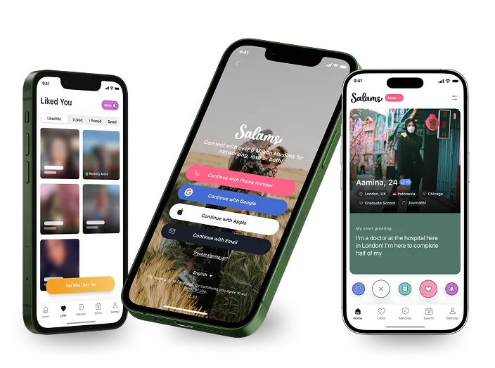
A dating app built for people who are serious about marriage.
Muslim matchmaking sits at the intersection of modern app conventions and deeply held cultural values around marriage, family, and community. I joined Salams in 2018 as the first design hire on a small team building the app from the ground up. As it scaled past its first million users, the experience was letting people down at every stage.
The app looked like every other dating app on the market. That was exactly the wrong signal for an audience that wasn't here to swipe casually. They were here to find a life partner. Users were dropping off during onboarding, fake profiles were eroding trust, ghosting was rampant, and the monetization felt awkward against the emotional weight of what people were trying to do.
I was the sole designer across all of these problems for 5 years, until Match Group acquired Salams in 2023.
Users were more serious than Tinder users. They wanted depth, not just swiping. Every interaction carried the weight of a potential life decision.
Ghosting carried real cultural weight. Being ignored after connecting felt disrespectful in a way that a generic dating app never accounts for.
Many users had family involved in their search. Trust and legitimacy weren't nice to have features. They were the product itself.
What problem was I solving?
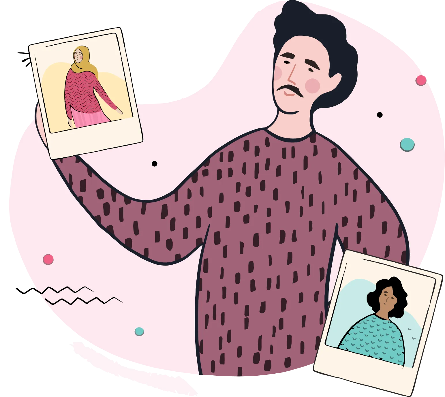
When was the last time a Muslim dating app felt like it understood you?
Generic dating apps are designed for casual connection. Salams users came for something far more serious: marriage. The app's look, feel, and flows sent the wrong message from the very first screen, and users were leaving before they ever matched.
When was the last time you trusted every profile you saw on a matchmaking app?
Fake profiles were a real crisis for this audience. In a community making marriage decisions, encountering a fraudulent profile wasn't just annoying. It was a betrayal of the platform's entire promise. Trust was collapsing and users felt it.
Why it mattered?
60 to 70% of new users were dropping off during onboarding before ever seeing a single profile.
↓ Brought down to 40% after redesign
The cultural reality
Ghosting someone on a Muslim marriage app doesn't just hurt. In this community, it's disrespectful and it was destroying retention.
→ Led to the anti-ghosting mechanic
Why do these numbers matter?
In a community built on trust and intention, every broken experience is a person who gave up on finding a life partner.
Delving deeper into the problem space.
Getting in the door
- •Why were users abandoning onboarding?
- •What fields were unnecessary friction?
- •How many steps was too many?
- •What did “trustworthy” look like on screen one?
Building trust
- •How do you prove someone is real?
- •What verification methods are acceptable?
- •How do you surface trust signals without feeling invasive?
- •What does a “safe” profile card look like?
Making matches meaningful
- •Why were matches not converting to conversations?
- •How do you discourage ghosting without being preachy?
- •How do monetization prompts serve the user's goal?
- •What does a respectful upsell look like?
Identifying the gap led to the solution:
A matchmaking app built specifically for Muslim users seeking marriage with trust built in, not bolted on, and monetization that serves people rather than manipulates them.
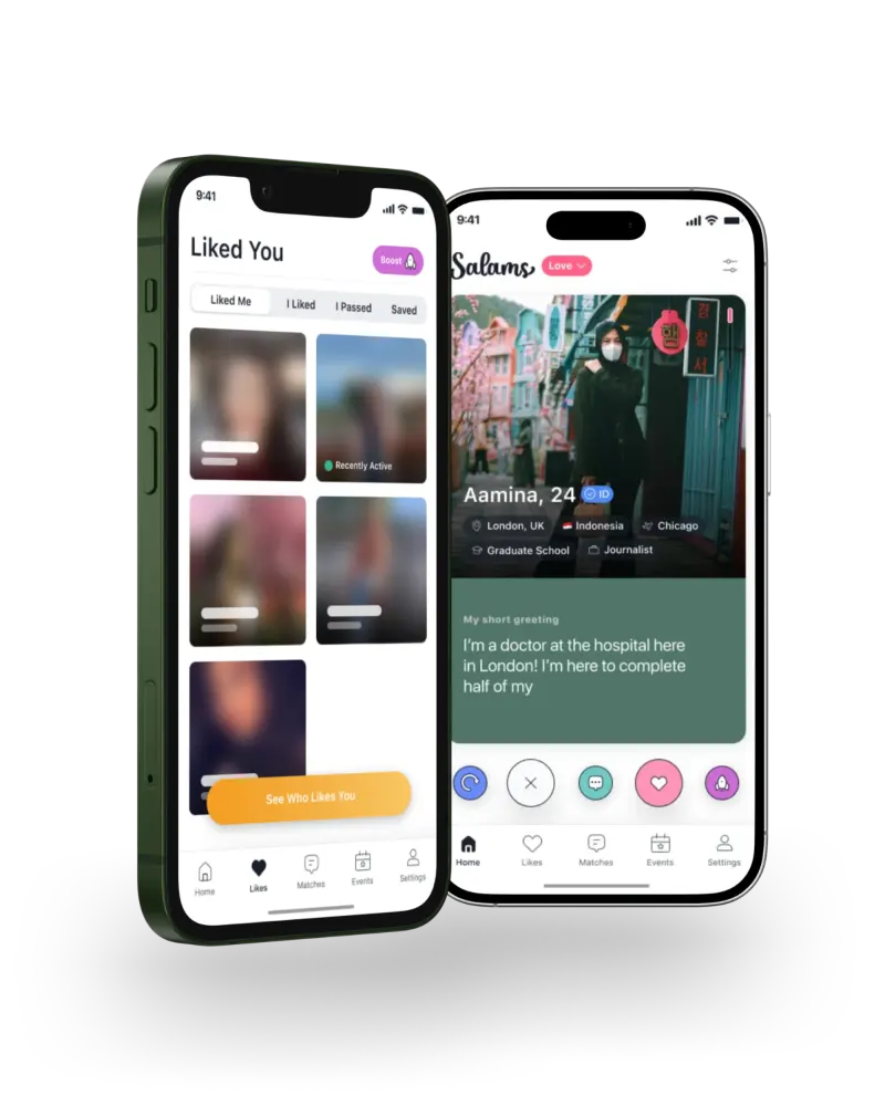
Salams aims to provide a holistic platform for Muslim matchmaking by offering a tailored experience built on trust, depth, and genuine intention.
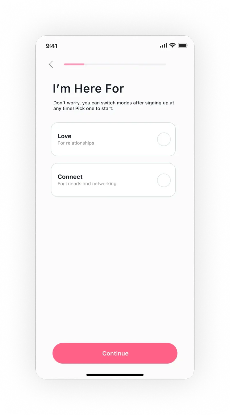
A redesigned onboarding with progressive disclosure, simplified steps, and a modern visual identity that signals trust from screen one.
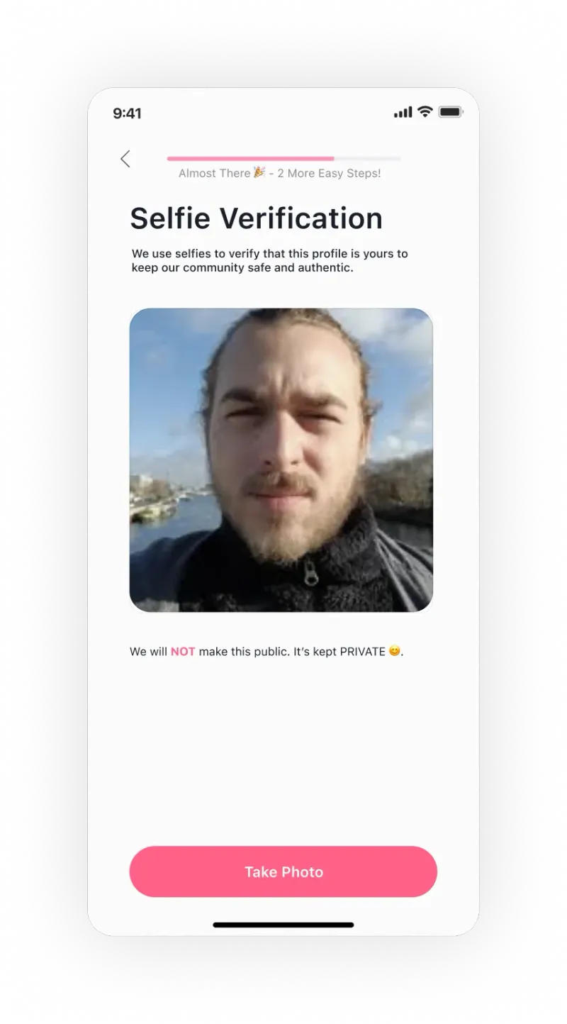
ID verification badge and selfie verification, surfaced prominently on every profile card to rebuild community trust at scale.
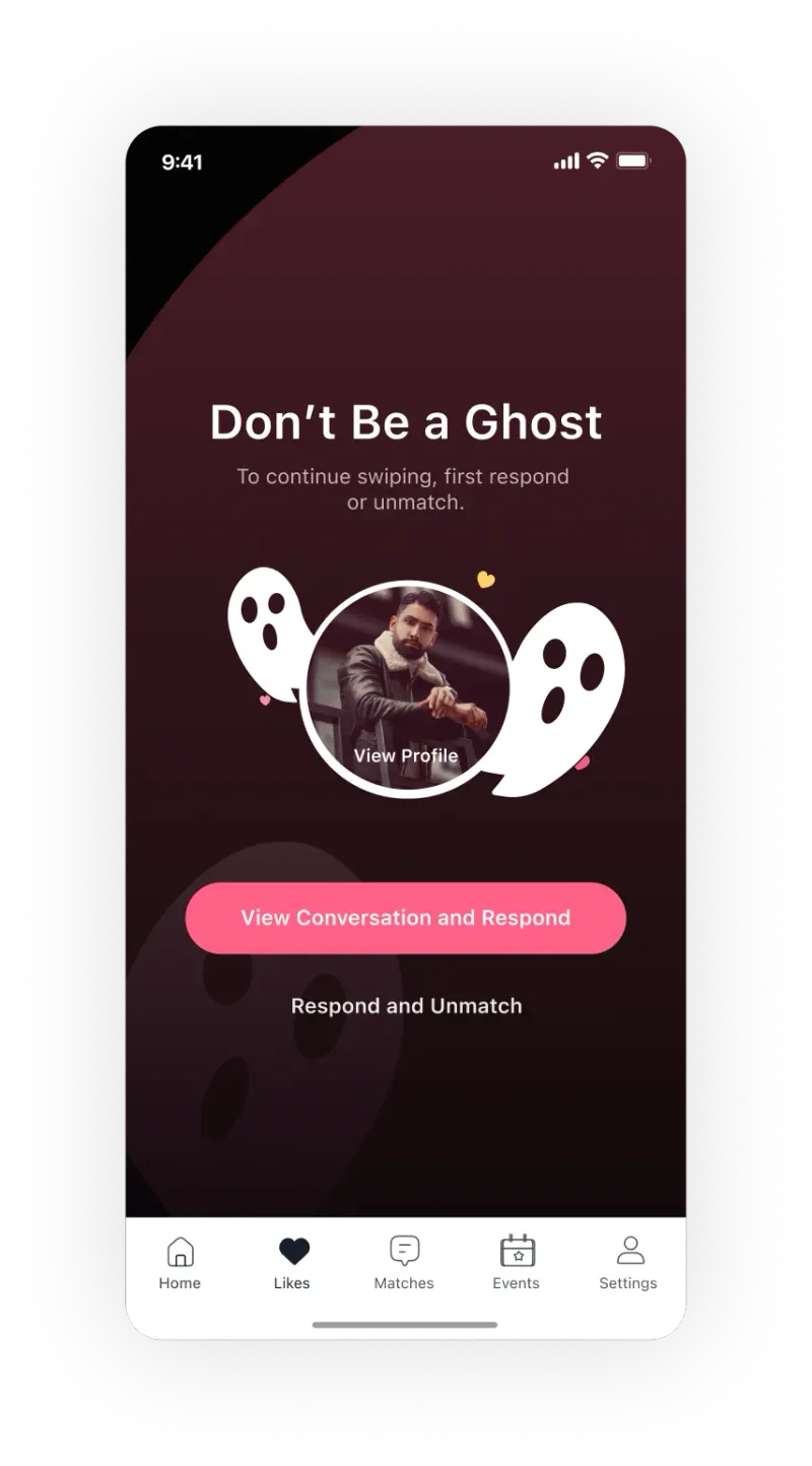
Anti-ghosting mechanic: if you haven't replied, the app forces a decision. Reply or unmatch. No silent disappearing allowed.
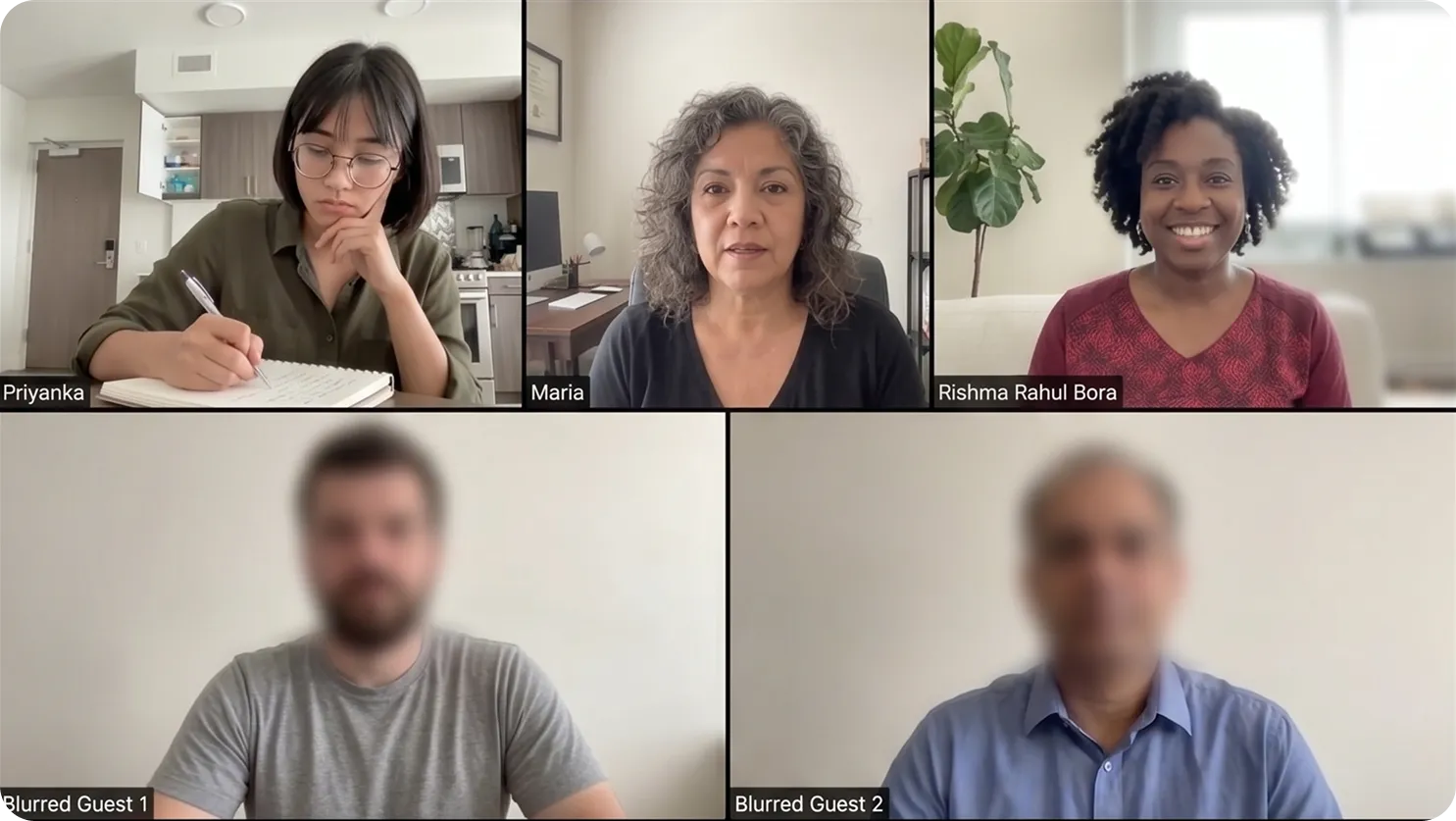
I ran user interviews to understand what people needed.
Participants were recruited through surveys and community outreach, helping me reach users across the two main archetypes. I ran usability tests alongside interviews to validate assumptions in real time.
Observation to Insights
The flow was asking too much, too soon.
- •Users wanted to see profiles before committing personal details.
- •Fields like "sect" and "income" felt intrusive on first use.
- •Progress indicators were absent, so the end felt unknowable.
I stopped using the app because I matched with someone who turned out to be completely fake. There was nothing to tell me they were real before I invested time in them.
Insights that shaped the approach
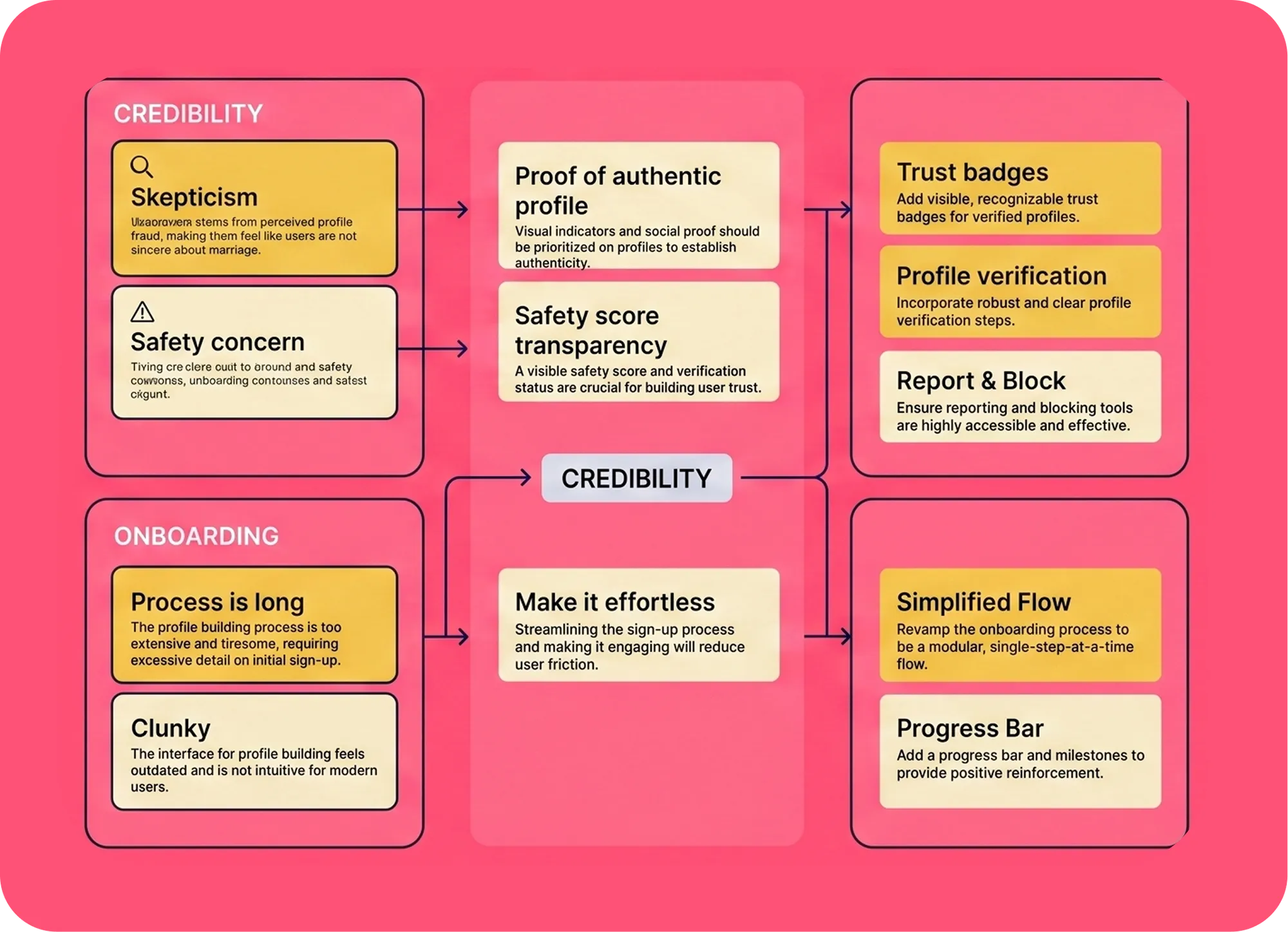
For each key theme from the research, I ran affinity mapping to surface the insights that would guide the solutions.
From those insights, I derived solution criteria which acted as design principles: trust must be visible, onboarding must feel effortless, and monetization must always serve the user's goal of marriage, not the platform's goal of revenue extraction.
Building the brand ethos.
Safety over speed.
We verify every user with selfie and ID checks. Trust isn't a feature you toggle on. It's the foundation the whole product is built on.
Respect is the floor.
Ghosting isn't allowed here. Every user deserves a response. Our mechanics enforce dignity, not just good manners.
Your goal is our goal.
We're committed to helping you find a life partner. Every upsell, every feature, every flow is designed to serve that goal not extract from it.
Detailed Solution
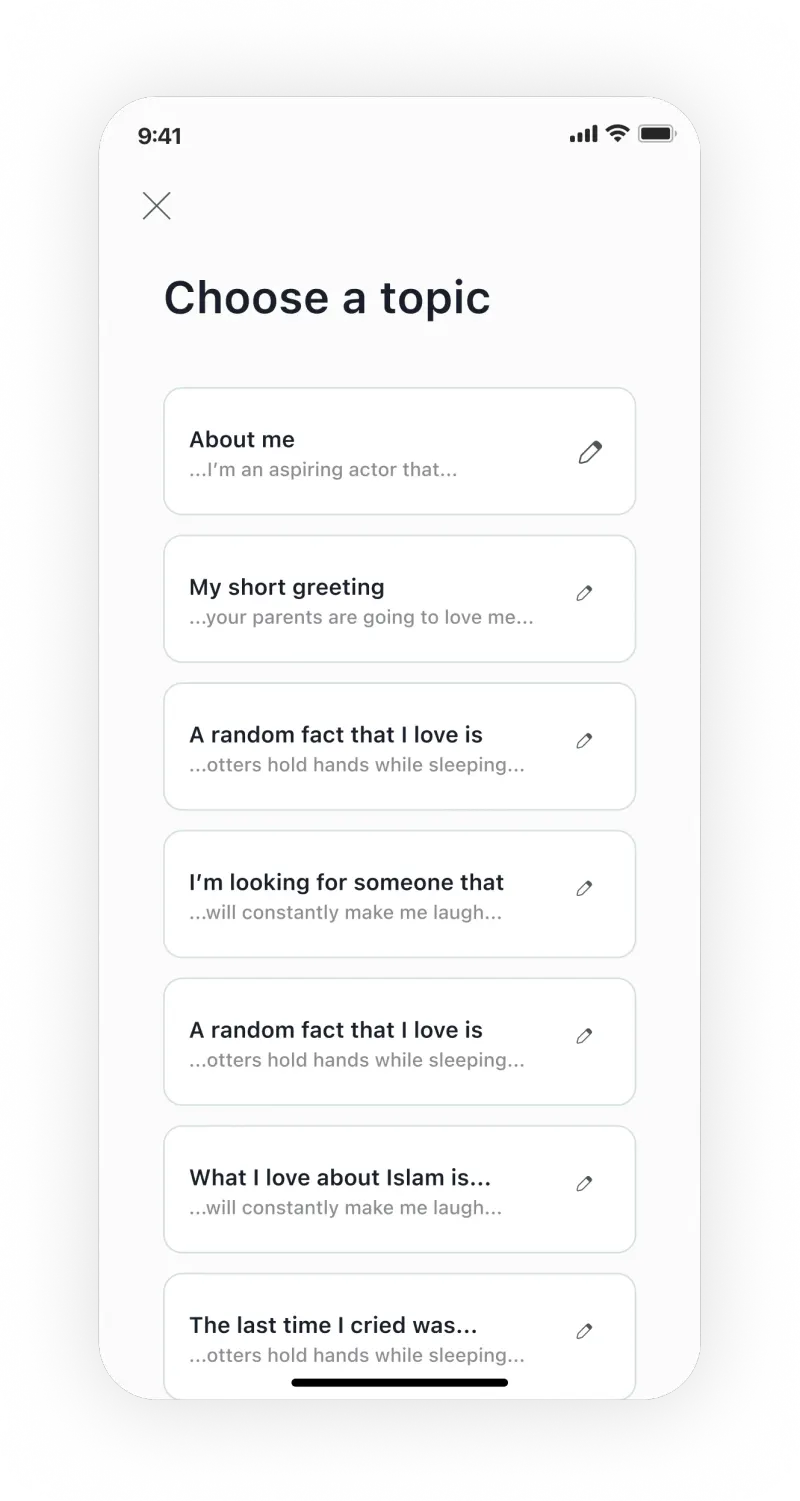
Redesigned Onboarding
Shortened the number of steps significantly and removed fields that created friction before users had a reason to trust us. Progressive disclosure means users build their profile over time, not all at once on day one.
The UI redesign also sent a new signal: this isn't Tinder. Clean typography, warm tones, and a clear sense of progress made the experience feel serious and modern from the first screen.
ID Verification & Trust System
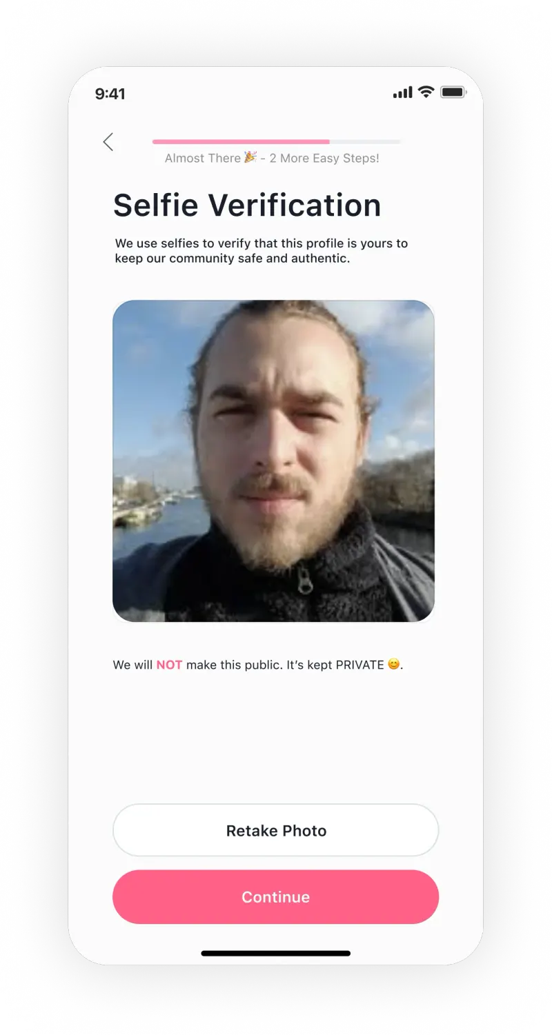
Selfie verification tied directly to profile creation. The ID verification badge appears on every profile card not as a one-time gate, but as a constant, visible signal throughout the entire app experience.
The reporting and blocking flows were also completely redesigned to feel useful rather than futile, and to surface in context rather than buried in settings.
Anti-Ghosting Mechanic
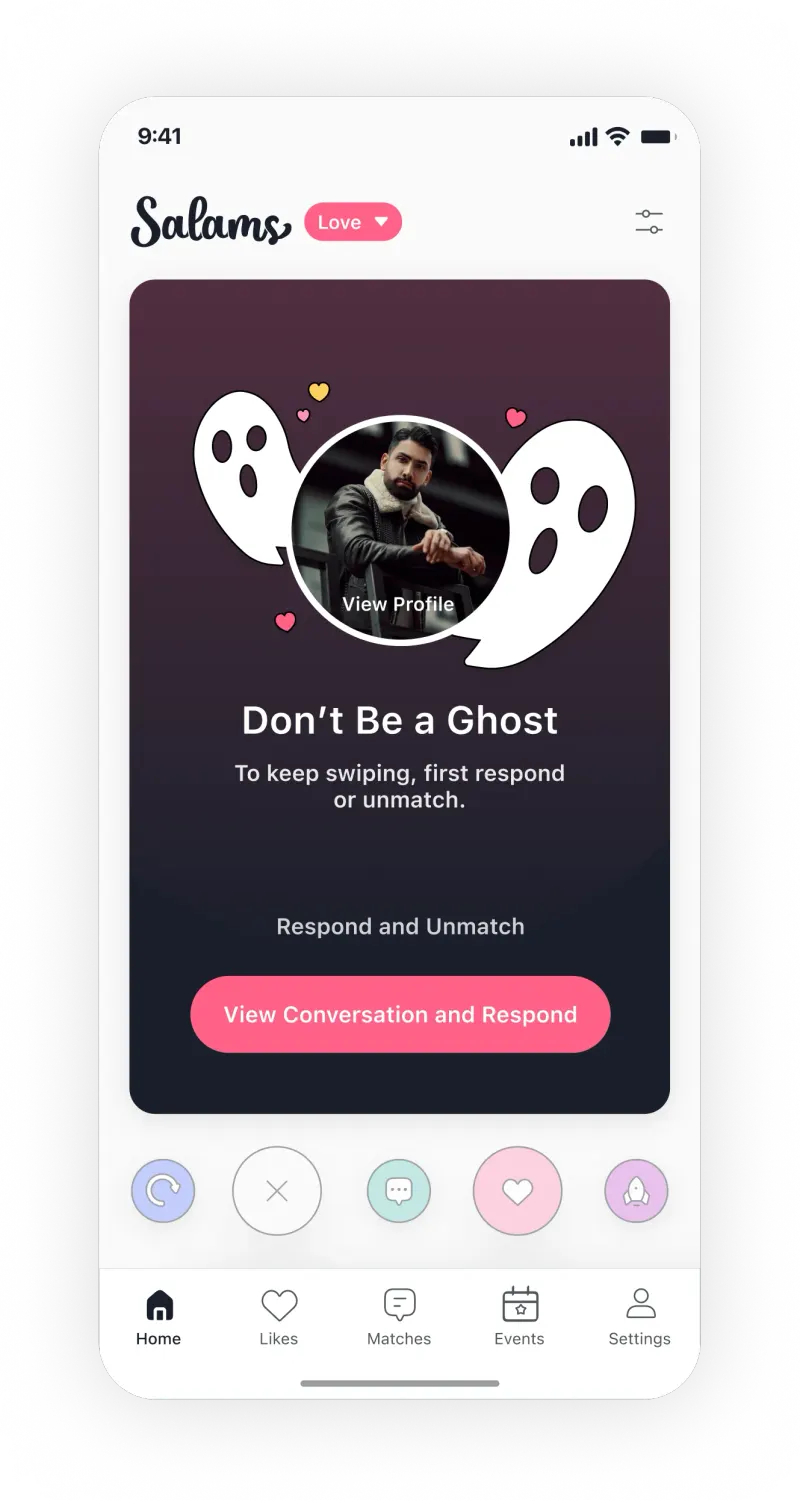
If you hadn't replied to a match and tried to move on in the app, a screen appeared forcing a decision: reply or unmatch. No silent disappearing allowed.
In a community where ghosting carries real cultural weight, this wasn't just a retention play. It was a statement about the kind of community Salams wanted to be.
Monetization That Doesn't Manipulate
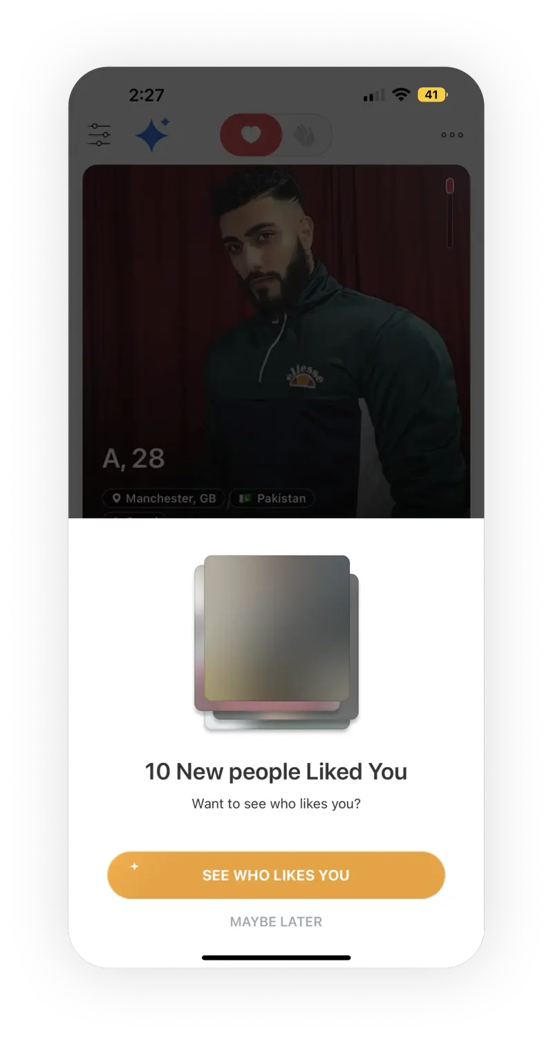
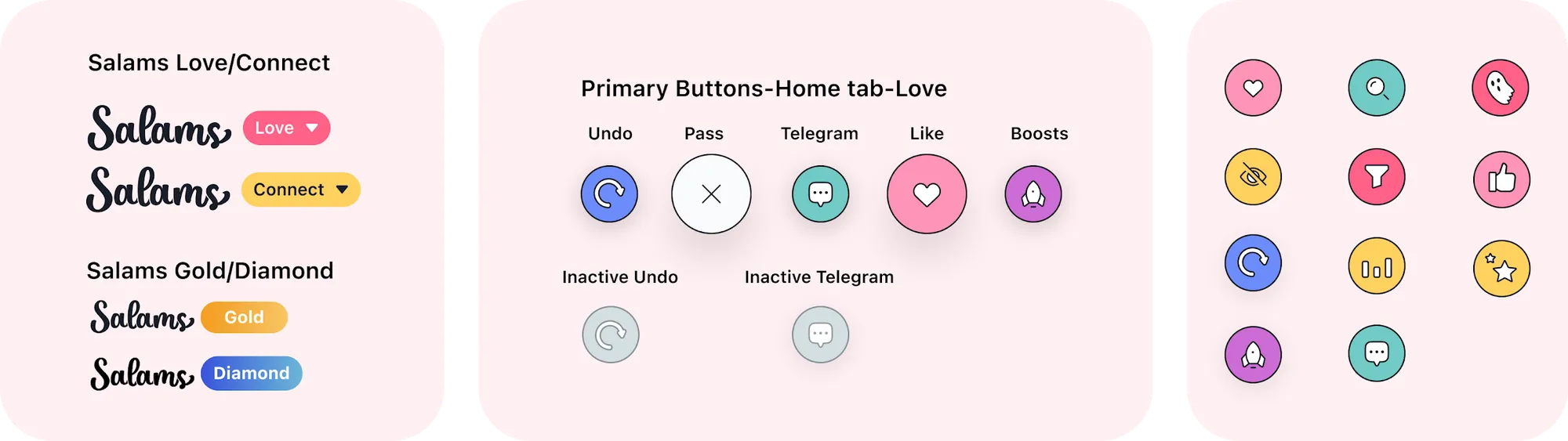
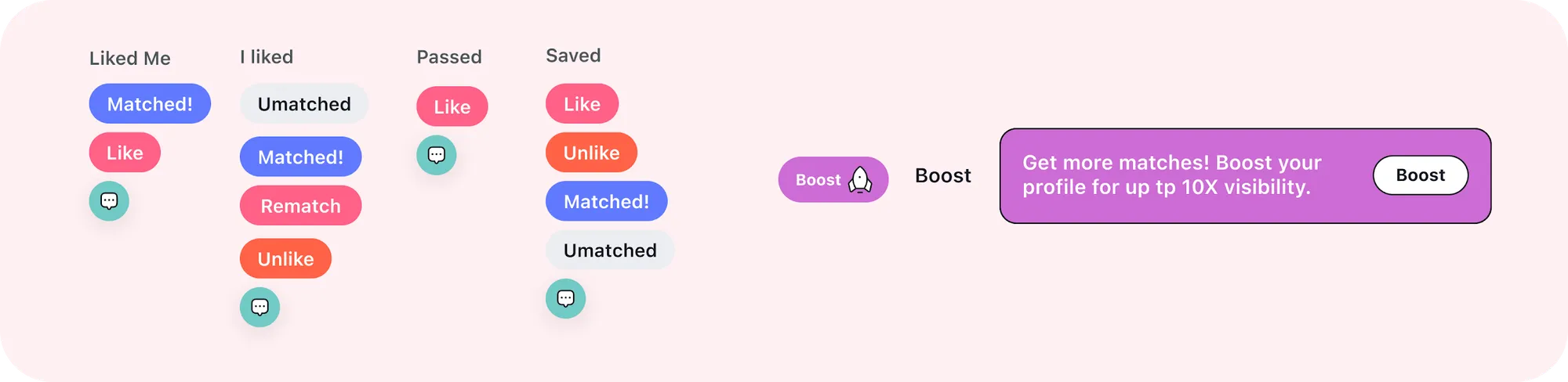
Designed the full monetization stack: Telegrams (paid ice breaker messages), Gold and Diamond subscription tiers, Boosts for visibility, and upsell prompts placed at high-intent moments like right after a match.
Every prompt was framed as a tool to increase your chances, not a gate to basic respect. This was the hardest design challenge of the 5 years and the one that taught me the most about ethical design.
Building a Design System
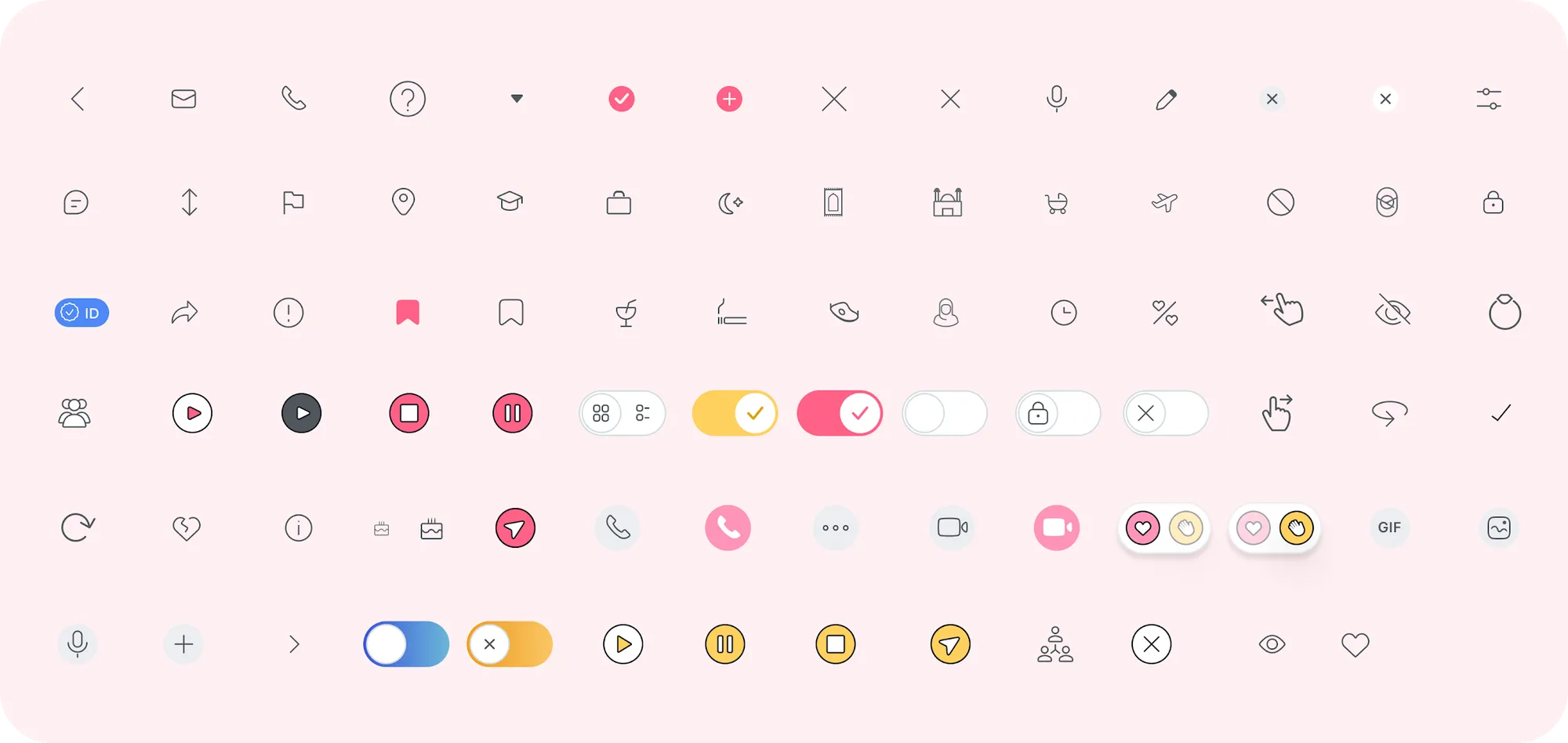
Building a design system made the non-linear, iterative process much smoother. Creating color and typography tokens, and reusable components allowed me to make consistent updates across the product.
How I led it.
The bet
Salams was betting that a dating app built around marriage, not swiping, could win a serious audience the big apps were failing. That only works if people trust it. With 60 to 70% of new users dropping off in onboarding and fake profiles eroding trust, the product had to earn that trust before it could grow or charge for anything.
My role and team
I joined in May 2018 as the first design hire and grew from Junior UX Designer to UX Designer (Sep 2019) to Senior Product Designer (Jan 2022 to Sep 2023).
I was the only designer for the whole run, working directly with the founders and the engineering team. I owned every part of the product experience: research, flows, UI, the design system, and usability testing.