Every AI assistant site looks the same: a glowing orb, a chat box, and big claims. I made Juno stand out by showing the product doing real work, and rebuilt its story, design system, and all nine pages in one week.
- Role
- Brand, web design and design system
- Industry
- AI and B2B SaaS
- Year
- 2026
- Timeline
- 1 week, 9 pages
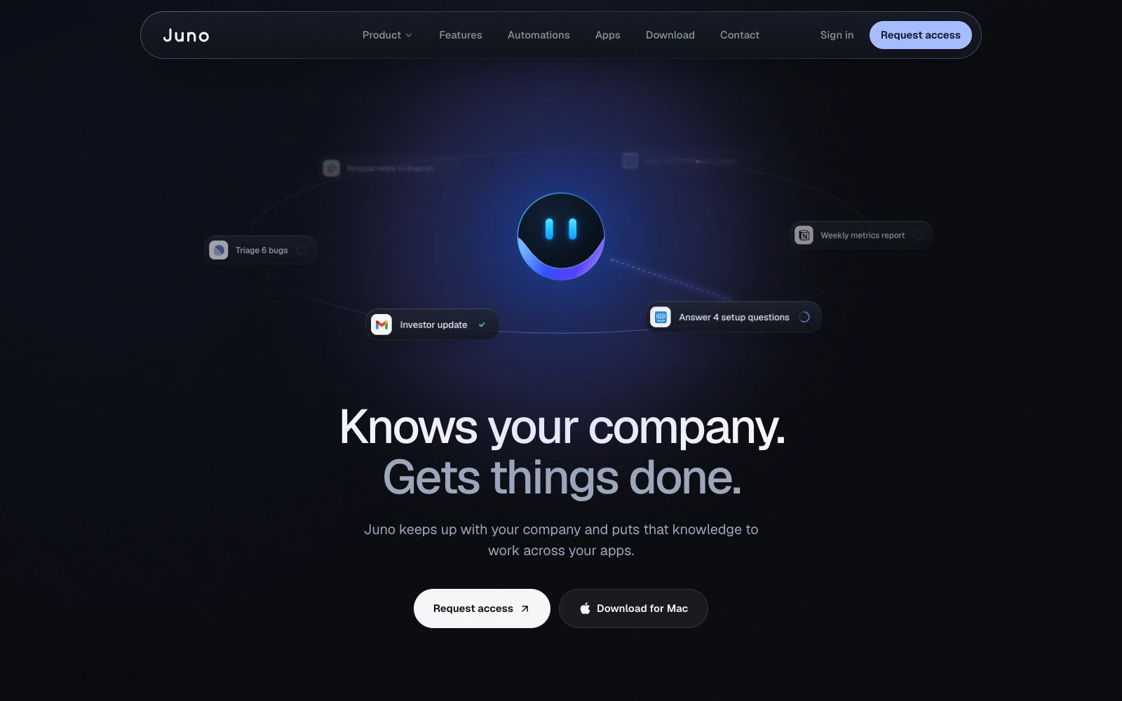
A crowded category where every site makes the same promise.
Juno is an AI chief of staff for teams: it connects to a company's tools, builds apps from a sentence, works on a computer of its own, and runs automations on a schedule. But "AI assistant" is one of the most crowded categories on the web, and most sites in it describe the same magic in the same words.
Juno's old site was no exception. It opened on the promise, told rather than showed, and gave buyers no reason to trust an AI with real work. My goal wasn't to explain Juno better. It was to make it impossible to mistake for any other AI product, by letting visitors watch it work and see it ask before it acts.
Explain Juno without jargon.
Build trust in an AI that acts on your behalf.
Feel premium and confident, not another generic AI landing page.
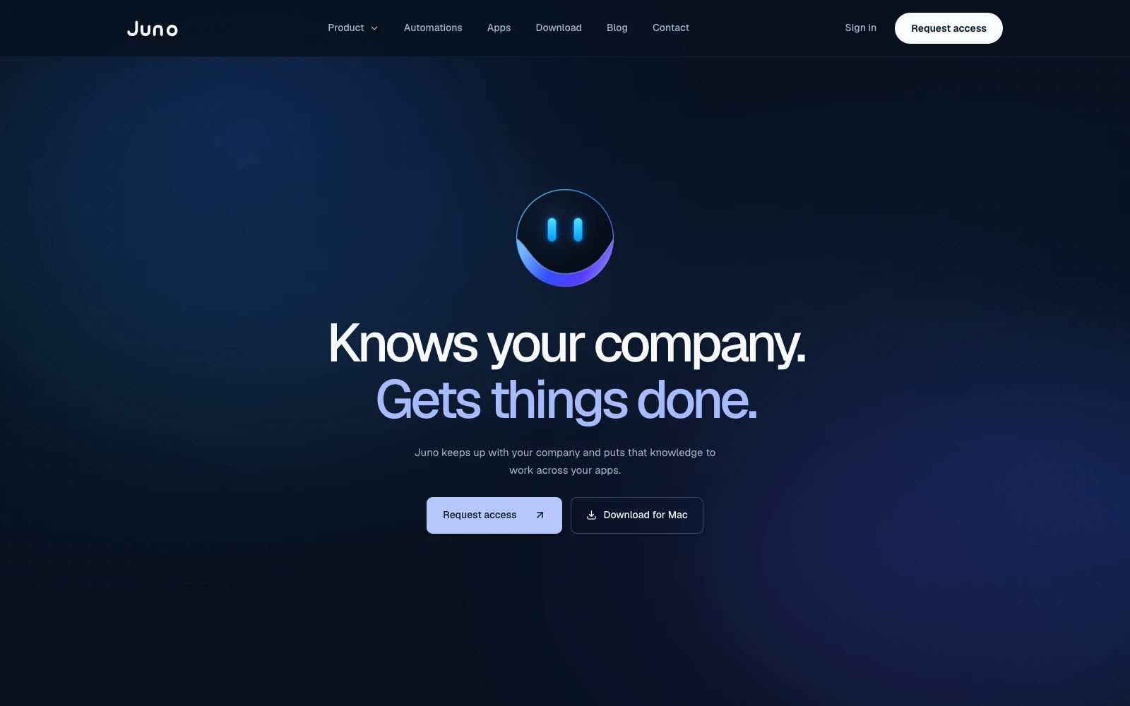
Same promise. Everything around it changed.
Drag to compare the old homepage with the new one. I kept the promise and changed what visitors see first, how the product proves itself, and how all nine pages hold together.
- 01
Pain before pitch
The old homepage opened on the promise. The new one opens on the overdue alerts every founder recognizes, then makes Juno the answer.
- 02
Shown, not told
Apps, Juno's own computer, and automations now run as live UI in one sequence, so visitors watch the product work.
- 03
One story, nine pages
One cast and one design system run through every page, where the old site introduced new sample brands section by section.
A homepage told as a story, not a feature list.
Six beats, from the pain every founder knows to a clear next step. Scroll through them.
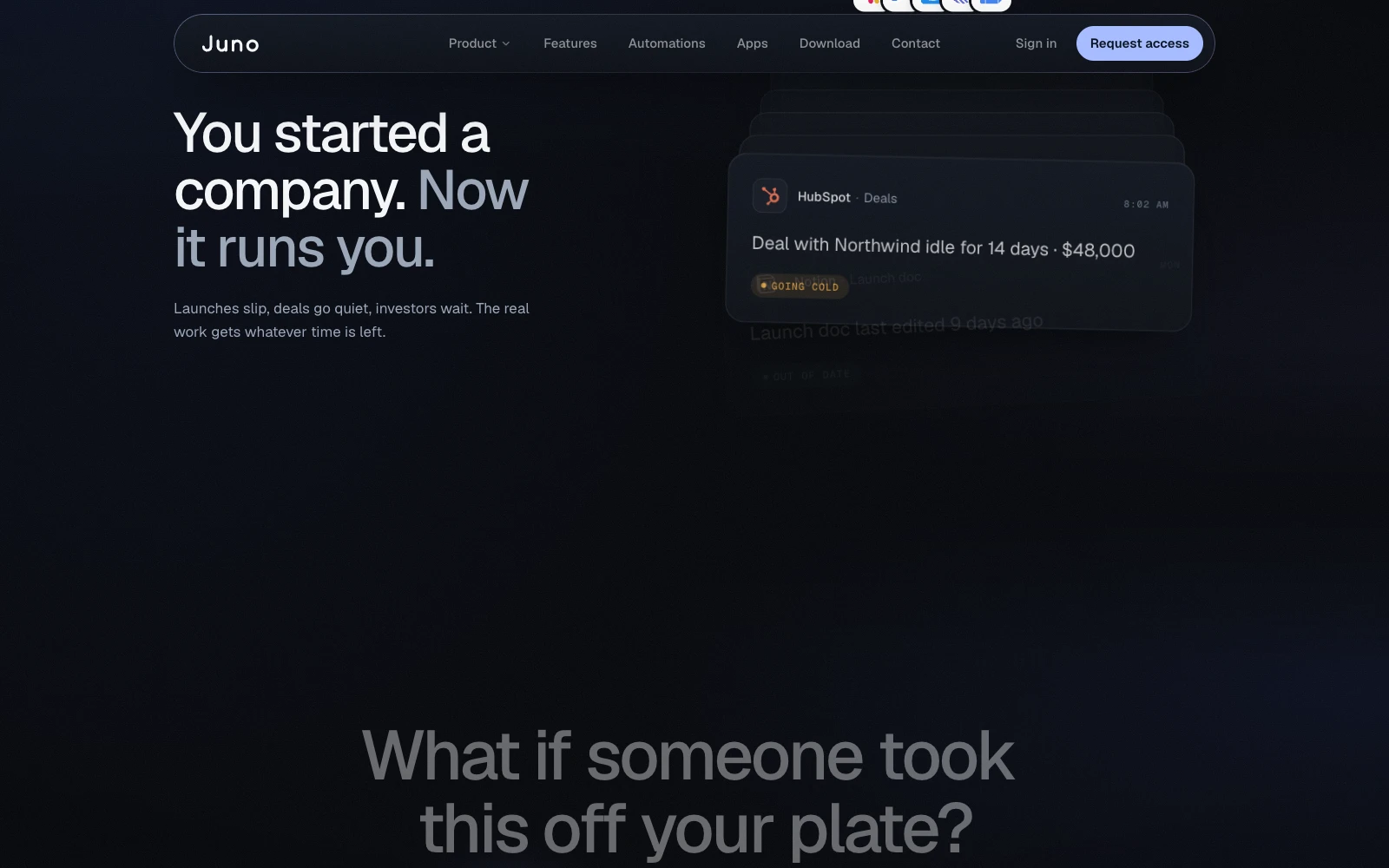
Open on the pain
"You started a company. Now it runs you." A pile of overdue Slack, Gmail, HubSpot, and Linear alerts makes the pain instantly familiar.
BeforeThe old homepage opened straight on the product promise.
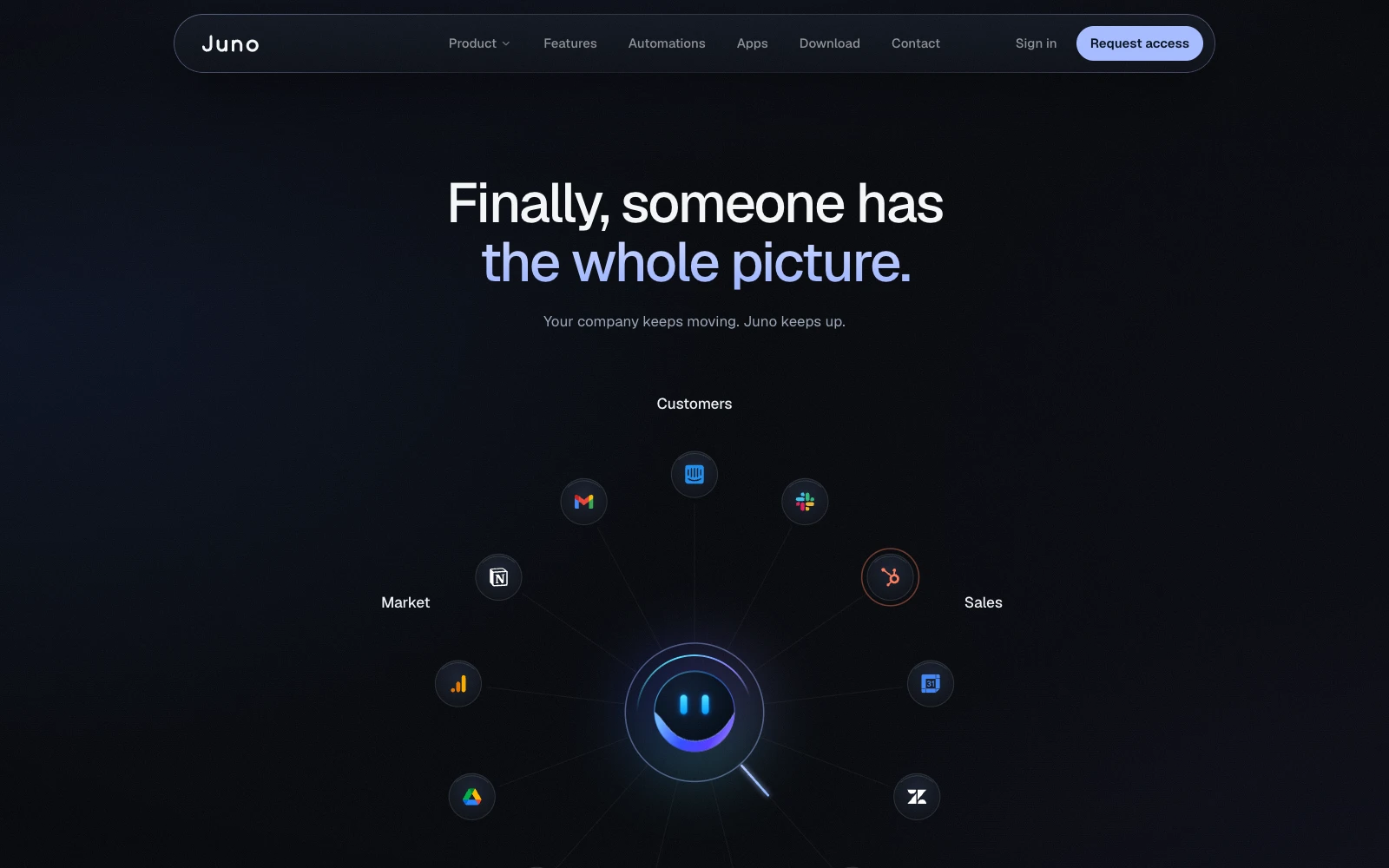
Make Juno the answer
"What if someone took this off your plate? That's Juno." The mascot pulls every tool into one ring.
BeforeThe product arrived before the problem did.
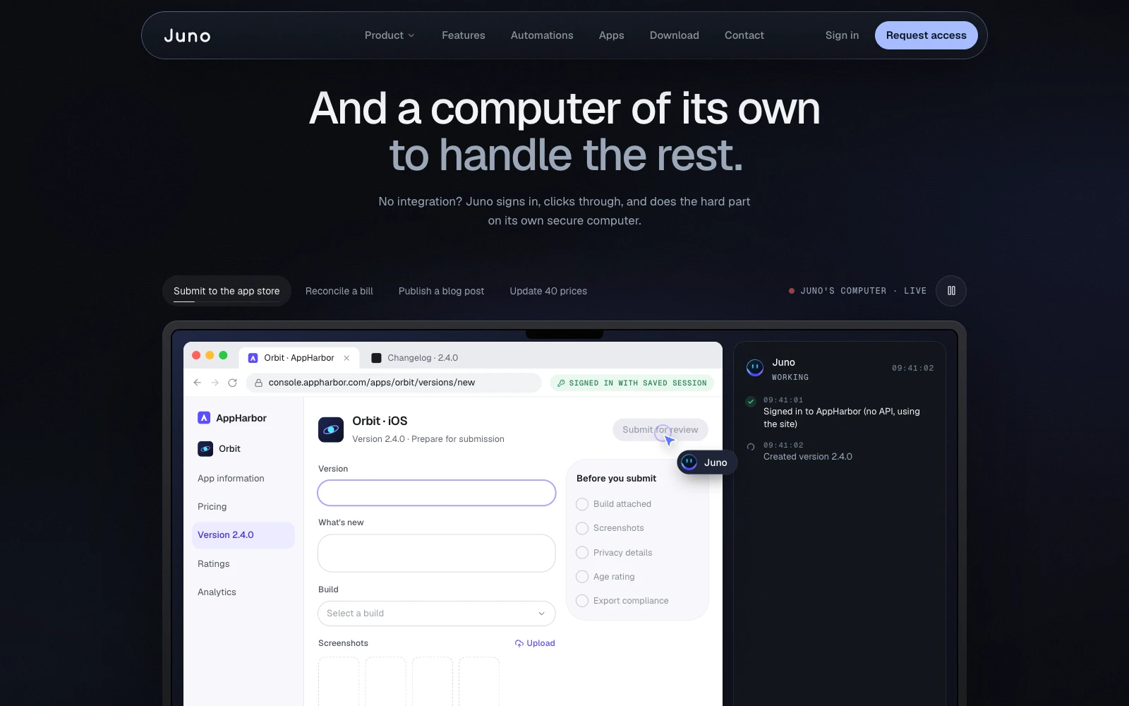
Show it working
Apps built from a sentence, Juno's own computer for tools with no integration, and automations on a schedule, back to back as live UI.
BeforeJuno's own computer sat near the end of the page, after the integrations.
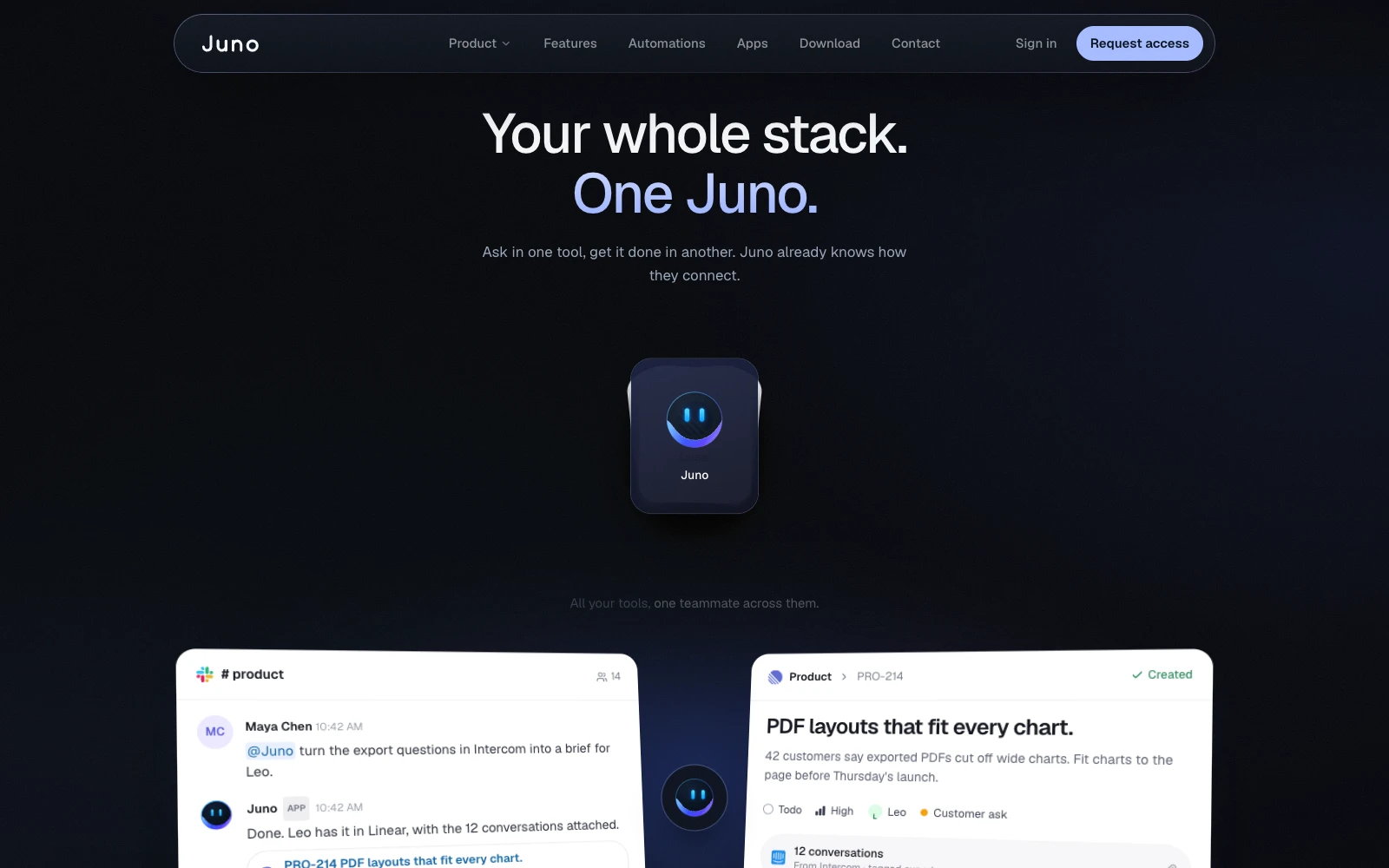
One stack, one teammate
"Your whole stack. One Juno." Ask in one tool, get it done in another.
BeforeI kept this line from the old site.
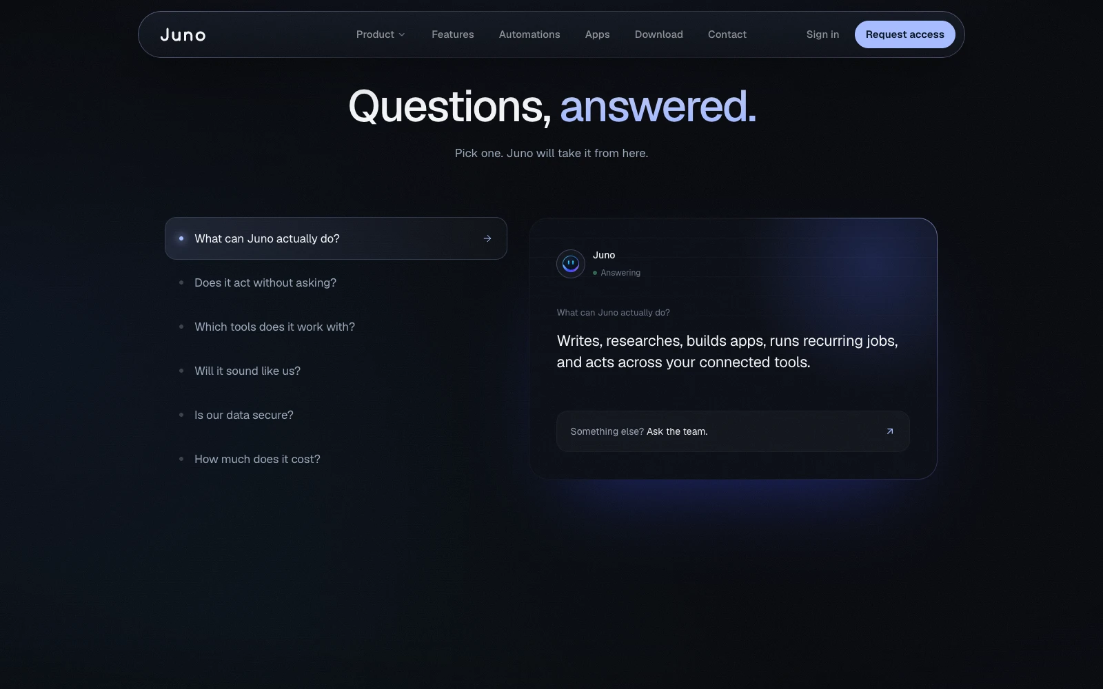
An FAQ that demos
Juno answers the questions in a chat, so the FAQ itself demonstrates the product.
BeforeThe old homepage had no FAQ at all.
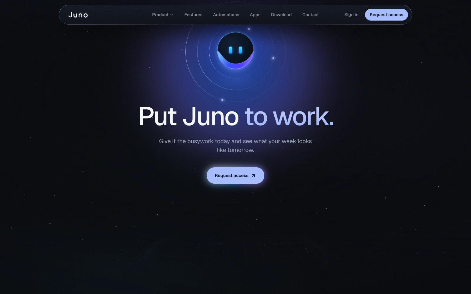
Close on action
"Put Juno to work." One clear request for access.
BeforeIt ended on "Imagine having Juno on your team."
Decisions that shaped the site
Dark mode only
One confident look, so every page and every product mockup sits in the same world.
Animation that explains
Live UI instead of screenshots. Motion shows the product working; it never just decorates.
One mascot shape
The mascot animates but never changes shape, so it stays recognizable on every page.
Structure first
Placeholder logos and testimonials let the structure ship before final content was ready.
Detailed Solution
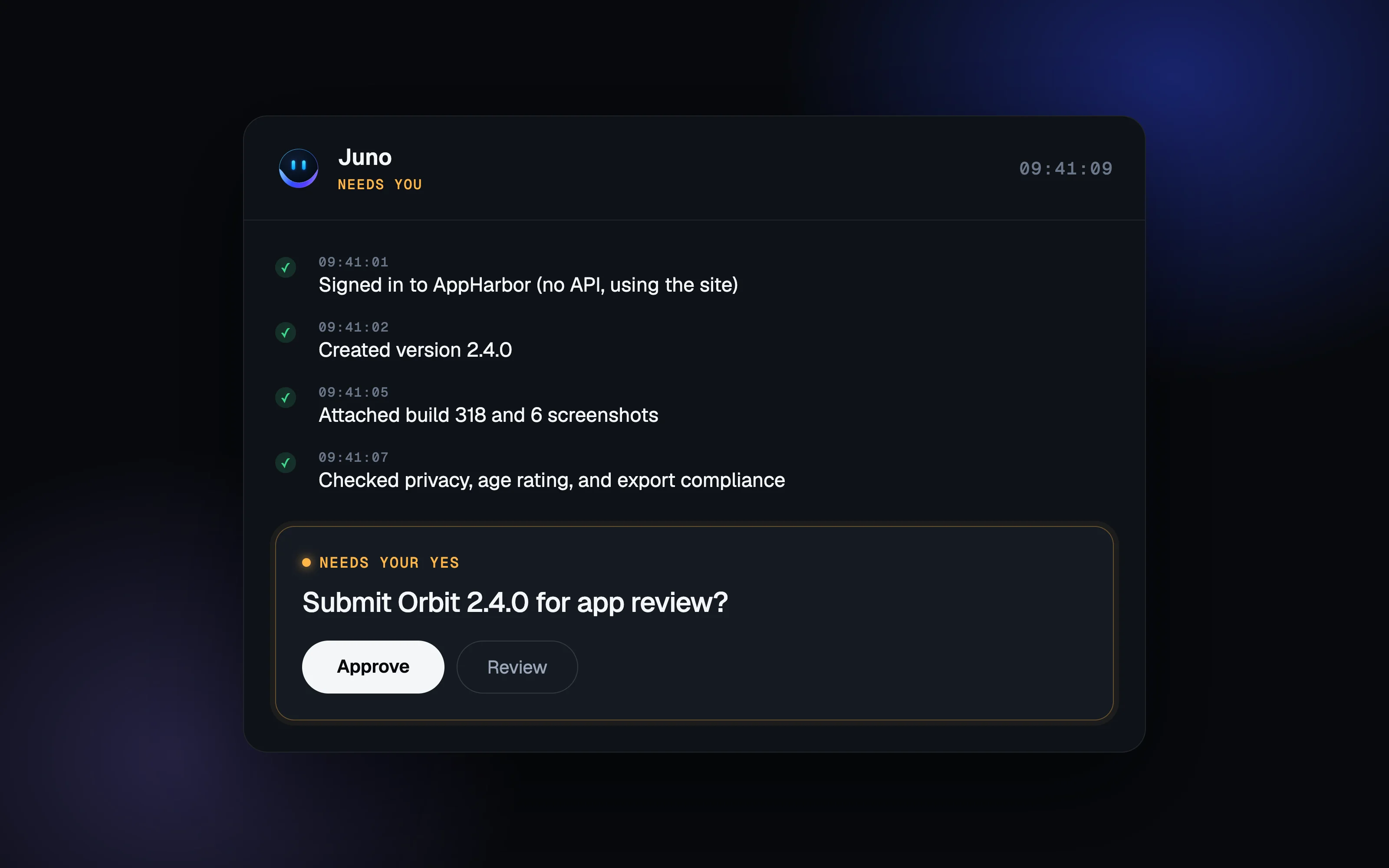
Needs your yes
The biggest fear with an AI that acts for you is that it acts without you. Other sites answer that with a line of copy. I designed an approval card that repeats on every page, so visitors see Juno ask before it submits, sends, or ships anything.
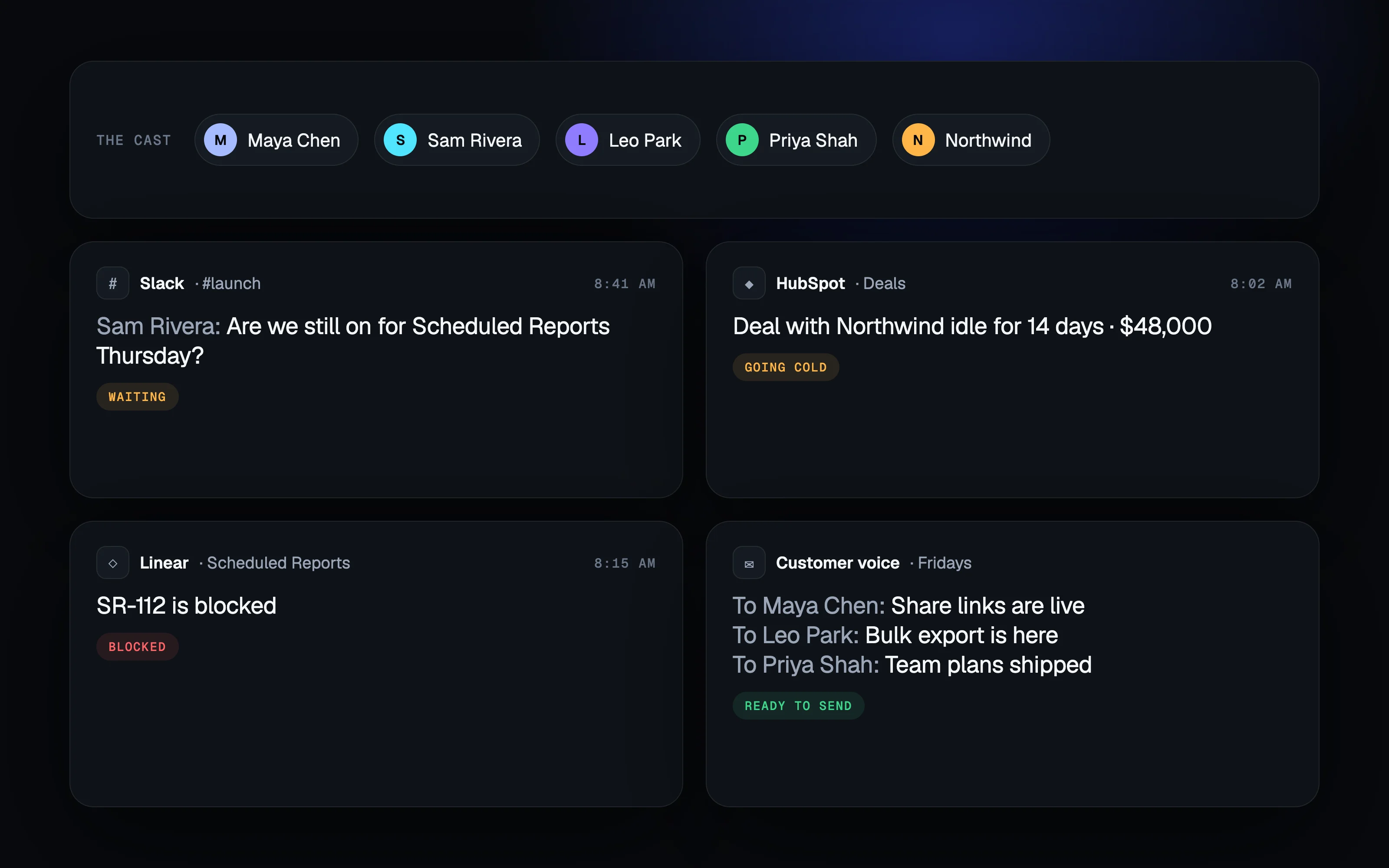
One fictional company
Most product sites use a new fake brand in every mockup, which makes each section feel staged. I wrote one fictional company instead: the same people (Maya, Sam, Leo, Priya), customer (Northwind), and launch (Scheduled Reports) run through all nine pages, so the site reads like one real week at one real company.
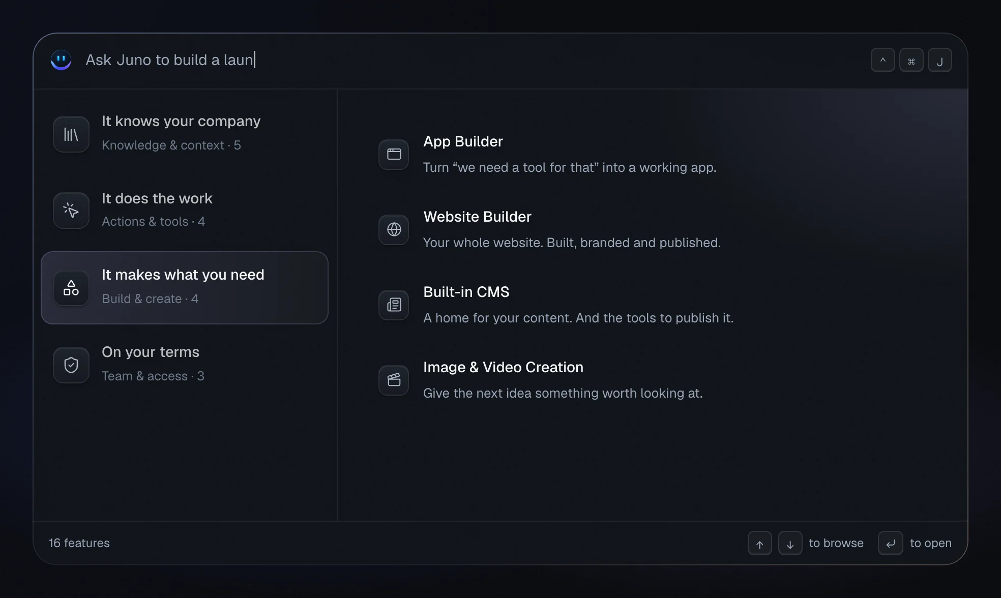
A command palette, not a grid
Every AI site has a features grid. I turned Juno's into a working ⌃⌘J command palette that types itself out, with 16 features grouped by what they do for you, so the page demos the product instead of listing it.
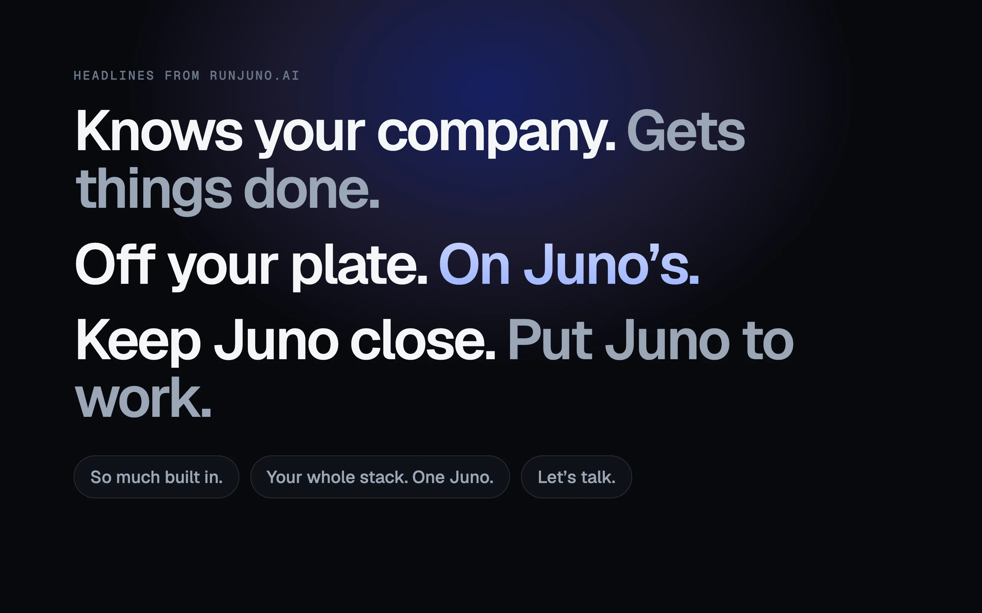
Short, human lines
The category talks in buzzwords: "supercharge", "10x", "agentic". I wrote short, human lines instead, like "Off your plate. On Juno's.", "Keep Juno close.", and "Put Juno to work.", so Juno sounds like a teammate, not a model.
Nine pages, one system.
After the homepage, the same system rolled out across every page. Hover to pause.
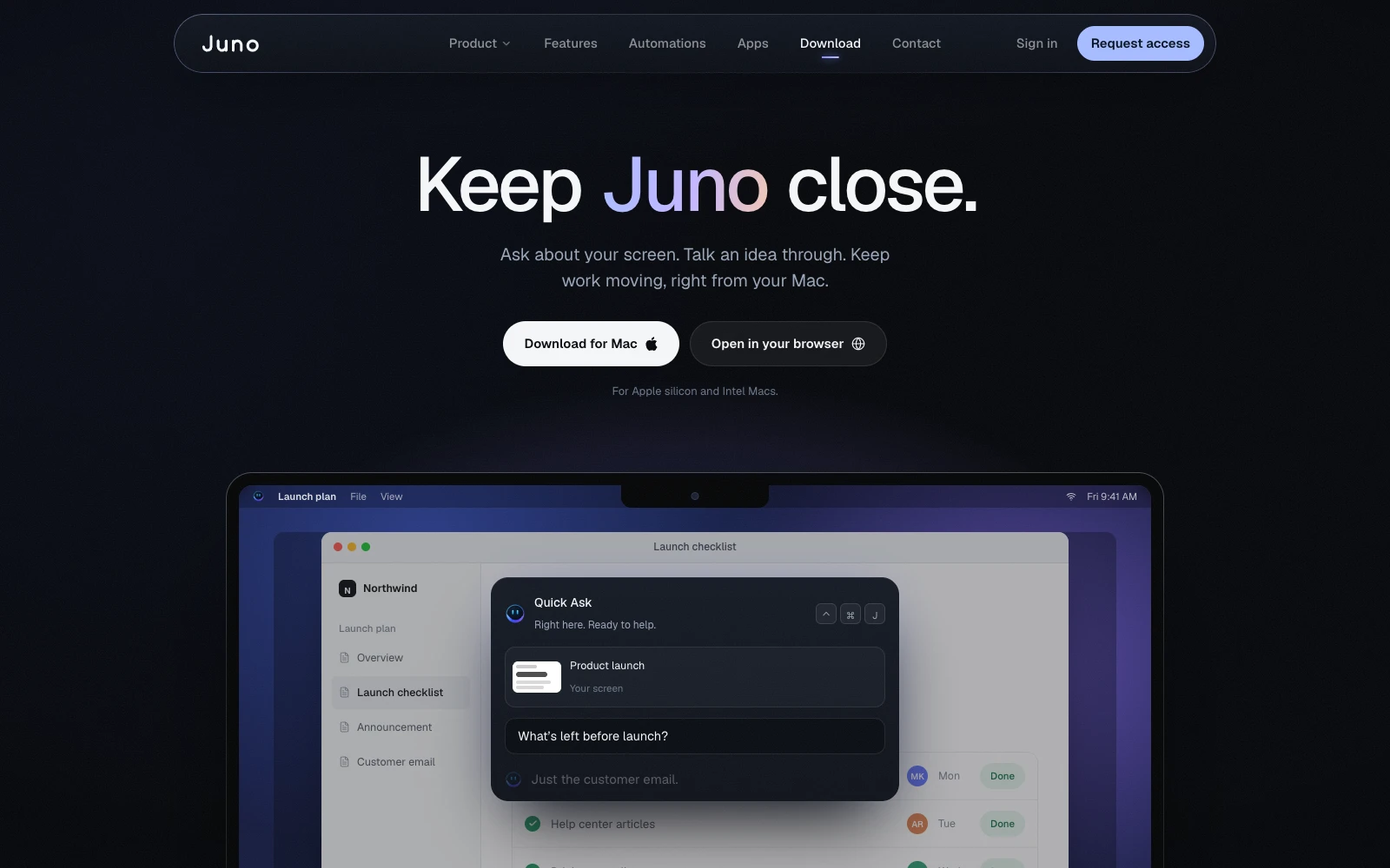
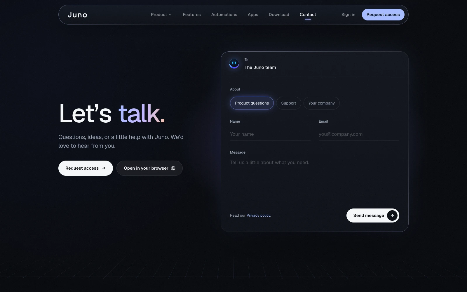
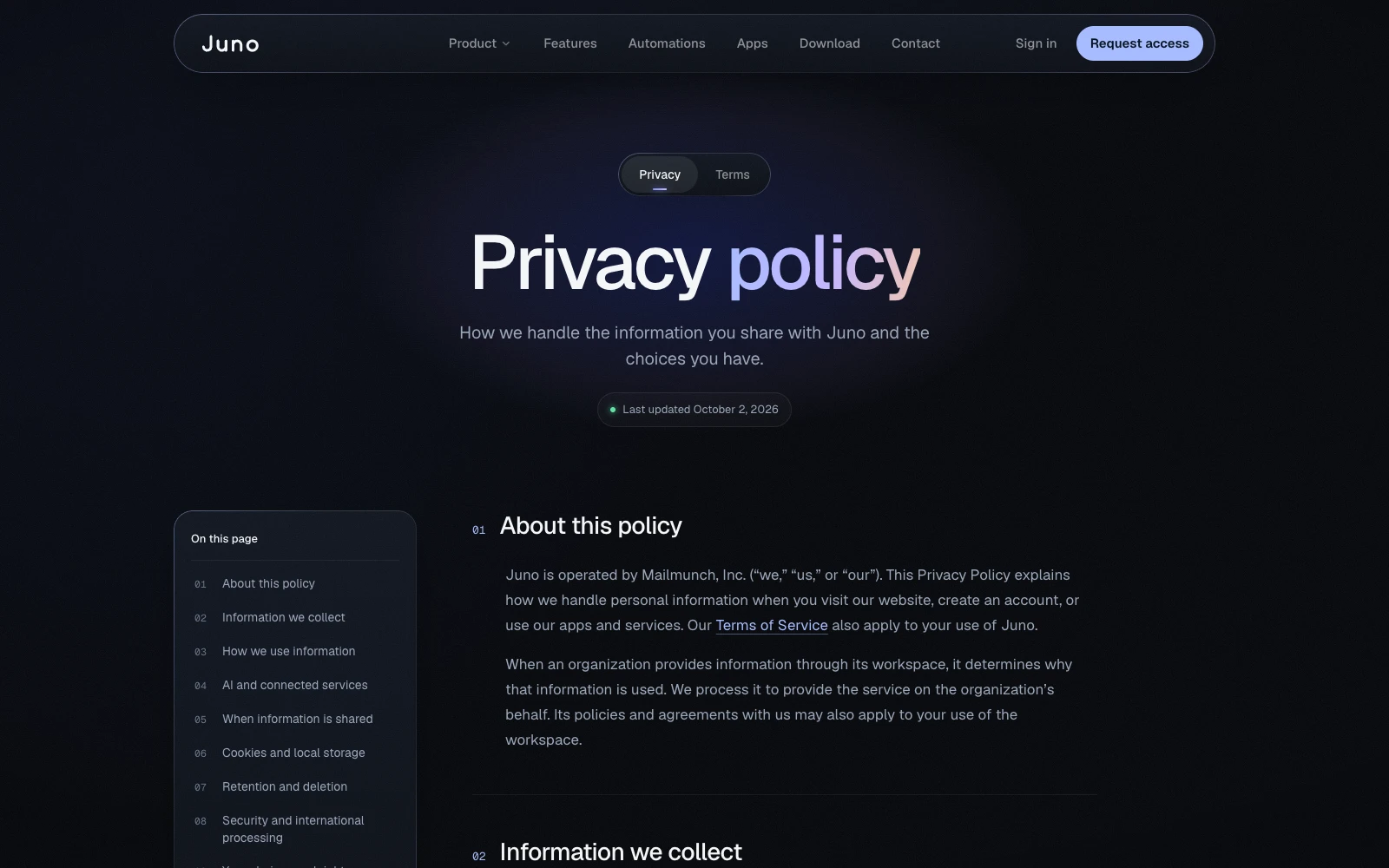
- Product: A full product tour told through one feature launch.
- Features: 16 features in a command-palette browser.
- Automations: 12 recurring jobs, framed as worries you can hand off.
- Apps: Six working mini-apps, including a real ROI calculator.
- Download: The keyboard shortcut is the hero, not the app icon.
- Contact: A form styled like writing an email.
- Privacy and Terms: One readable template with a sticky table of contents.
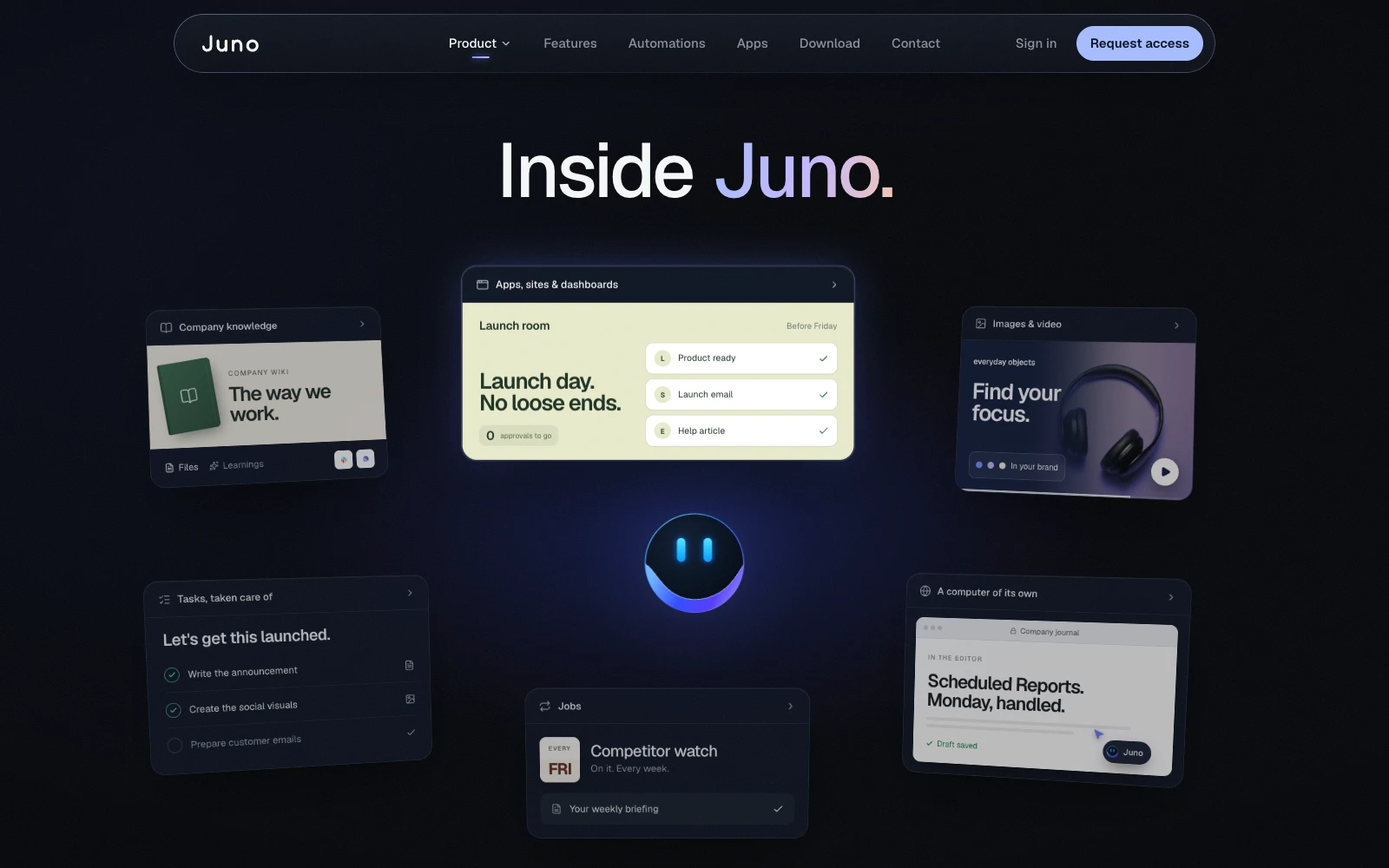
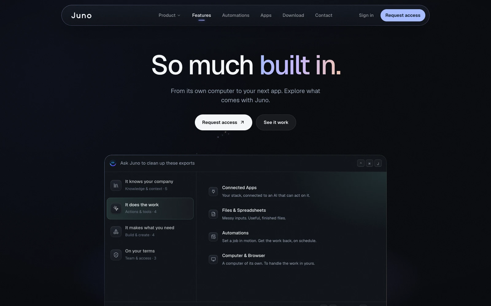
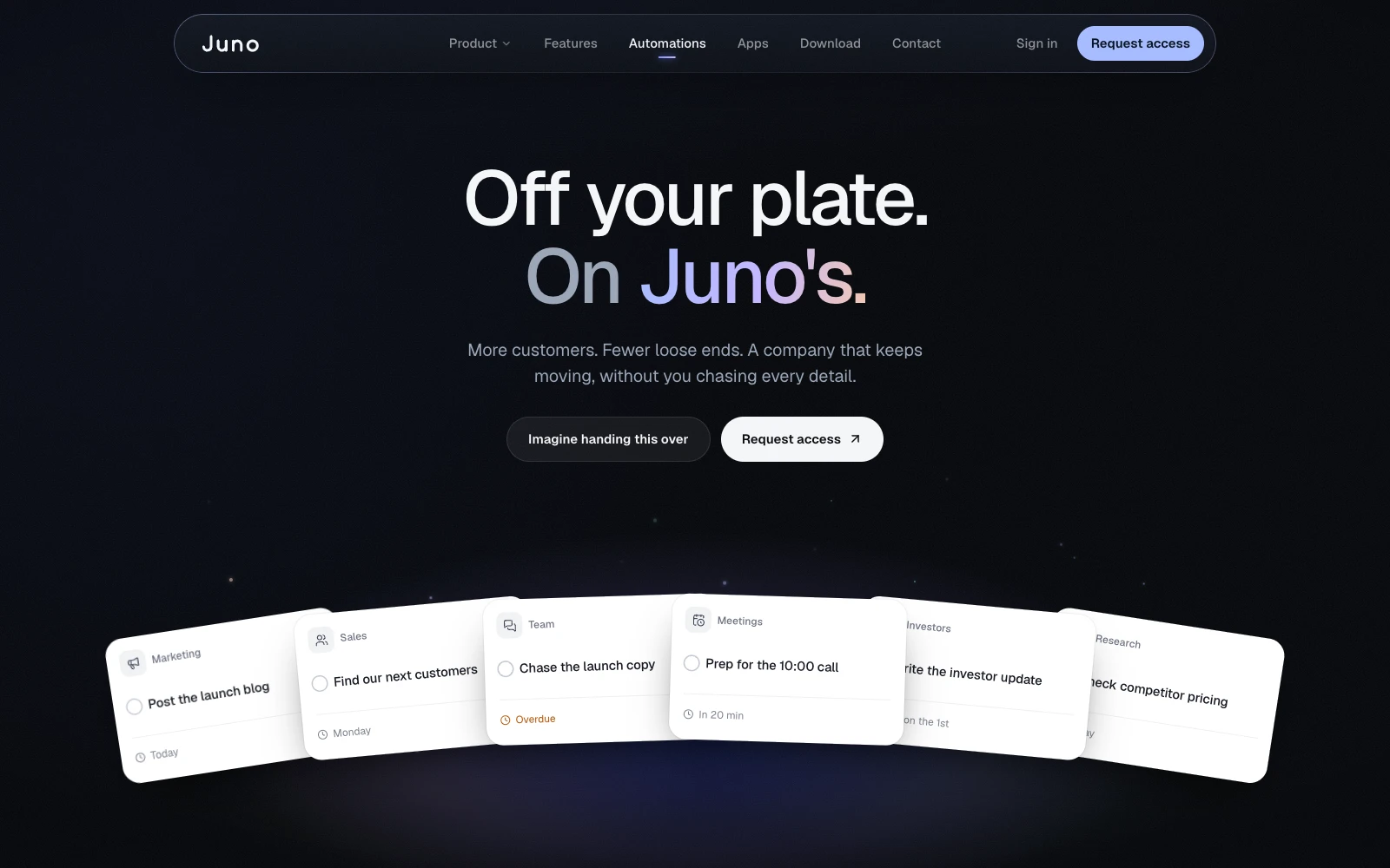
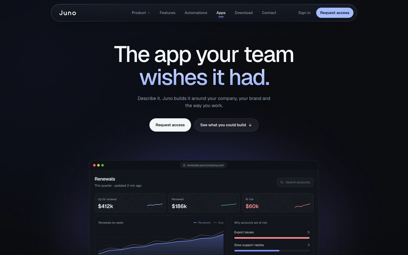
One dark system for every page
A near-black surface scale with blue, cyan, and violet accents, Geist for type, four radii, and three motion curves for everything from quick UI responses to story-scale moves. Task cards, approval cards, and chat mockups are the core components every page is built from.
Color
- Background#07090d
- Surface#0e1218
- Surface 2#151a22
- Text#f4f6f8
- Muted#9aa6b8
- Blue#324cff
- Cyan#50e5ff
- Violet#8f7cff
- Success#3dd68c
- Warning#ffb547
- Danger#ff6568
Type · Geist Sans and Geist Mono
- Knows your company.Display XL
48 to 88px - Put Juno to work.Display L
40 to 64px - Your whole stack.Heading 2
28 to 36px - Needs your yesHeading 3
20px - Juno keeps up with your company.Body
16 to 18px - JUNO'S COMPUTEREyebrow
12px
Motion
- Snap · Quick UI responses
- Base · Most transitions
- Calm · Story-scale moves
Launch-ready in one week.
- 1 week
- From kickoff to a launch-ready site
- 9 pages
- Rebuilt on one design system
- 6 beats
- In a homepage told as a story
- 1 cast
- Running through every page
How I led it.
The bet
"AI assistant" is a crowded, vague category. The bet was that buyers would trust an AI that acts on their behalf only if they could watch it work, so every page shows the product doing real jobs and asking for approval, instead of describing features.
My role and team
I owned the design end to end, from tone and design guidelines through the homepage and the rollout across all nine pages, working directly with Juno's team from kickoff to a launch-ready site in one week.