Designing Zewards, a loyalty system for real world visits
I led product design across the consumer app, business app, and marketing site for Zewards, a loyalty and cashback platform for real world merchants. The work focused on activation, clarity, and building a loyalty model that fits inside a thirty second interaction at the counter.
38%
Increase in repeat visits
After improving reward clarity and progress visibility
2.3x
Faster first time activation
Through a single decision onboarding flow
54%
Higher reward redemption
Driven by simpler rules and clearer next steps
Designed for everyday places built on repeat visits: coffee, lunch, groceries, and neighborhood stores.
Snapshot
What Zewards needed from product design.
The gap
Loyalty tools were either paper level simple or enterprise level heavy. Neither survived inside a thirty second interaction at the counter.
The opportunity
Use a QR based flow to tie real visits to rewards that feel tangible enough that people return on purpose.
My role in that
Connect consumer app, business app, and marketing site around one clear loyalty story that owners can actually repeat.
Branding
How Zewards looks and feels in one place.
Logo

Zewards presents itself with a calm, confident wordmark. Color and motion come from rewards and progress, not from the logo shouting at people.
Brand tone
The brand aims for bank level clarity with neighborhood warmth so it feels at home in coffee shops, supermarkets, and salons without looking like a heavy finance tool.
Color palette
Typography
Display
Poppins Bold
Headlines, hero copy, and key promotional moments.
Body
Inter
Body text, labels, and system UI.
Product ecosystem
One loyalty model expressed through three experiences.
From the start I treated Zewards as one system with three views, not three separate builds. The same visit based logic shows up as a consumer app for people, a business app for operators, and a website for decision makers.

Consumer app
Scan, track, and redeem rewards without reading instructions.
Business app
Set campaigns, place QR touchpoints, and see what is working.
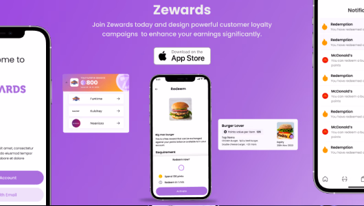
Marketing site
Explain Zewards in revenue and repeat visits instead of feature lists.
Problem
Loyalty felt either outdated or over engineered.
Most loyalty stories die at the counter. Staff do not have time to explain complex rules. Customers are in a hurry and will not download an app they do not understand. Owners see dashboards they never log into after the first month.
Zewards had a strong starting point. Reward real visits instead of generic points, make scanning trivial, and let people redeem rewards in ways that feel like real value. The challenge was to shape that into a product that fits inside the reality of service, not just a pitch deck.
Constraints I designed around
- No real training time for staff, learn as they use it on shift one.
- Signups that must fit inside a single visit while an order is being made.
- Owners who want repeat visits, not another analytics product to manage.
- Small engineering team, so the design system needed to be realistic to ship from.
Design story
How I shaped Zewards from idea to product.
Start from how loyalty already behaves
Instead of imagining a perfect flow, I watched how people were already running loyalty in scrappy ways and where it was breaking.
- Interviewed shoppers about how they track rewards and when they stop paying attention.
- Spoke with owners about punch cards, ad hoc free coffees, and tools they tried and abandoned.
- Mapped the end to end journey for customer, staff, and owner in a single visit and across a month.
Reduce everything to one mental model
Every decision had to reinforce one simple loop that works in the real world.
- Scan once, see progress, know what happens next, no matter which screen you are on.
- Consumer app IA centered on today, progress, and reward details instead of complicated account areas.
- Business app IA centered on set up, run, and understand so merchants can act without a playbook.
Turn flows into a design system
Once flows were stable, I built a compact design system that could support new campaigns and features without rethinking the interface every time.
- Figma components for navigation, cards, reward states, QR entry points, and empty states.
- Design tokens for color, type, spacing, and elevation so changes stay coherent.
- Documented interaction patterns for scanning feedback, redemption, and error states for the dev team.
Test where friction actually shows up
I used prototypes to look for friction that would kill repeat behavior, not just visual polish.
- Tested onboarding, first scan, and first redemption with realistic scripts.
- Simplified copy and tightened hierarchy where people hesitated or second guessed rewards.
- Adjusted campaign presets so merchants could launch effective loyalty without complex configuration.
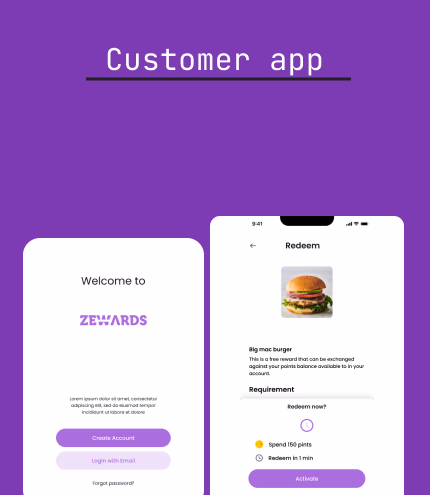
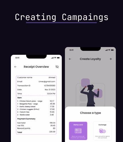
Consumer app
Designing the consumer app for trust, clarity, and repeat use.
The consumer app is where the loyalty promise either becomes a habit or disappears. I designed it for people who do not think of themselves as using a rewards platform. They are just picking up coffee, lunch, or groceries, and Zewards has a few seconds to feel trustworthy and useful.
North star
Earn and redeem in one glance
You should be able to open the app at the counter and know instantly what you earned and what is next.
Tone
Bank level clarity, cafe level warmth
The product handles money and rewards, so the language and visuals had to feel confident without feeling corporate.
Behavior
Tiny loops, not big journeys
Design for quick visits that repeat often instead of long sessions people never repeat.
How that translates into UX decisions
- Onboarding is a single decision, not a form: join or not, with the minimum fields needed to build trust.
- The home view answers three questions clearly: what did I earn, how close am I, and what should I do next.
- Reward details remove fine print energy. Rules are written in language staff can repeat at the counter.
- Interaction design focuses on fast confirmation around scan and redemption so people are never unsure if it worked.
Product designer takeaways
This part of the work reflects how I think about consumer UX: anchor on one clear mental model, use language that people can repeat out loud, and design flows that respect short, messy, real visits instead of idealized journeys.
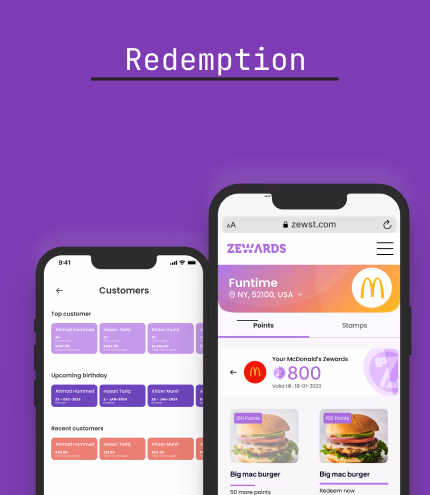
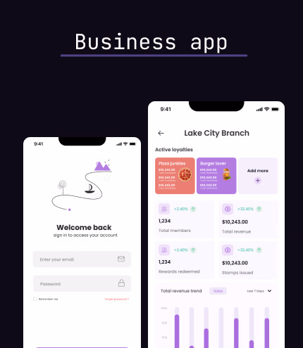
Business app
Giving merchants control without overwhelming them.
The Zewards Business app is used by owners and managers who are always in motion. The UX needed to respect that context. It had to feel like a tool they could understand in a few minutes and hand off to staff without docs.
- Campaign creation framed in business language like repeat visits and average ticket size.
- QR and in store placements organized around how staff actually interact with customers.
- Performance overview that answers one question first: is this worth continuing.
- Layouts and contrast tuned for shared devices and less than ideal lighting or network conditions.
System in use
How the system feels consistent on both sides of the counter.
Zewards only works if it feels like one product from every angle. The same story has to show up when a customer scans, when a staff member explains a reward, and when an owner checks performance.
Process
How I worked through the problem as a product designer.
Research and framing
Combined interviews, lightweight surveys, and competitor review to frame the problem around repeat visits and trust instead of only cashback mechanics.
Information architecture
Kept both apps shallow and clear. The top level focuses on the handful of actions that matter most and pushes rare actions out of the way.
Prototyping and validation
Used Figma prototypes at different fidelities to test flows with real service scenarios, then tuned copy, hierarchy, and defaults based on feedback.
System and handoff
Documented components, tokens, and interaction rules so engineering had a clear, realistic source of truth to build from and extend.
Design stack
The tools that supported the work.


Reflection
What Zewards says about how I design products.
Zewards was not a cosmetic redesign. It was a chance to align product strategy, behavioral UX, and visual design around the reality of service. The work was to make loyalty feel light for staff, trustworthy for owners, and obvious for customers across multiple touchpoints.
It reflects how I like to work as a product designer. Start from behavior, shape a clear mental model, and then build a system that a team can ship from and extend without losing the story.
This project shows that I
- Can lead B2B2C product design across consumer, business, and marketing experiences.
- Translate messy real world loyalty behavior into clear journeys and interaction patterns.
- Build Figma based design systems that are visually strong and pragmatic for engineering.
- Design for activation, repeat use, and long term clarity, not just individual screens.