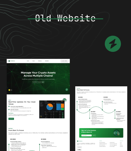
Redesigning a wallet viewer into a strategy first portfolio product
FolioNomics began as a way to see balances per wallet. As the product designer, I reframed it around strategies, risk, and runway so investors can see how their capital is deployed across chains instead of staring at isolated addresses.
My role
End to end product design
Research, information architecture, flows, and visual system.
Core shift
Wallets to strategies
Portfolios became the primary object. Wallets became liquidity sources feeding them.
Product impact
Faster first insight
New users reach a strategy view in one session instead of bouncing between wallets.
Product type
Consumer crypto portfolio
Focus
Strategy views and risk clarity
Team setup
Founder, engineer, product designer
My ownership
Problem framing to usability tests
Branding
FolioNomics
Calm, analytical, and strategy first. Built for portfolio thinking.
Logo

The brand keeps surfaces soft and neutral so charts, risk, and performance are the only loud elements.
Color palette
Typography
Display
Roc Grotesk
Headlines and key portfolio views.
Body
Inter
Body copy and interface labels.
Product snapshot
One tracker for all chains, organized by strategy not chaos.
The redesigned home view gives investors a single place to see portfolios, risk bands, and chain exposure. Same on chain data, but finally mapped to how people think about their capital: long term bets, experiments, yield, and reserves.
What this view unlocks
One place to see strategies, risk bands, and chain exposure instead of fragmented wallet views.
It turns FolioNomics from a wallet viewer into a portfolio tool that supports real decisions.
What my work unlocked for the product
This was not a cosmetic refresh. The redesign changed the mental model of the product and set it up to support serious use cases like tax, reporting, and performance analysis.
Product thinking
Strategy centered model
Portfolios now mirror how investors think about capital long horizon, high risk, yield, and reserves instead of how wallets are set up.
Flow design
Onboarding to insight
Flows guide users from wallet connection to a meaningful strategy view so they can answer real questions without exporting data.
Systems design
Foundation for growth
The same structure that powers current views can support tax, reporting, and exchange imports without forcing a redesign.
Problem before the redesign
FolioNomics could show what sat inside each wallet, but it did not match how people think about their crypto wealth. Serious users were exporting data into sheets just to understand which bets were long term, which were experiments, and where their actual risk lived.
The product answered where a token lived instead of what the capital was doing and how fragile a strategy was. That meant the interface was informational but did not support decisions.
What I learned from research
- People group assets into strategies, not into chains or individual wallets.
- Most do not know their true concentration risk until it is visualized at portfolio level.
- Plain language risk bands work better than dense metrics for non institutional users.
- Being honest about data quality builds more trust than pretending every number is perfect.

How I approached the redesign
I treated this as a systems and decision making problem first and a visual problem second. Each step aligned the data model, flows, and interface to how investors talk about their money.
Discover: understand how people really manage crypto
I spoke with investors who spread capital across exchanges, self custody wallets, and DeFi protocols. The goal was to capture the questions they ask themselves every week, not only the tools they use.
- Which strategies they mentally separate when they think about holdings.
- How they decide when to rebalance, exit, or add to a position.
- Where they see the full picture of risk and runway today.
Almost everyone had a clear mental model of their portfolio, but almost nobody had a product that reflected it. That gap became the starting point.
Design decisions that changed how people use the product
These decisions did not just change screens. They changed the questions investors could answer inside FolioNomics without running back to spreadsheets.
Rationale
People were already thinking in terms of long term bets, high risk experiments, yield plays, and reserves. Reflecting that in the product makes it easier to map their mental model to the interface.
Impact
Investors can now reason about capital by strategy instead of jumping between wallets and chains. It also gives the team a stable base for new features.
Designing for fintech reality
Crypto data is noisy. Rules vary by region. People mix centralized and decentralized holdings. I made design choices that respect this reality instead of pretending it is a clean lab.
- Clear risk bands and concentration flags instead of complex ratios.
- Separate confirmed on chain data from estimates so trust is preserved.
- Keep tax and reporting out of core flows, but shape the model so they can be added later.
- Frame portfolios so exchange balances and off chain assets can plug in through the same concept.
Stack and prototyping approach
I worked with realistic synthetic portfolios and price behavior so we could see how the interface holds up when markets move, not only in calm states.
The design system is modular so future modules like tax, reporting, or deeper analytics can share the same hierarchy and patterns instead of feeling bolted on.


What this project says about me
FolioNomics is where I shifted a product from nice charts to real portfolio thinking. I did not only tune interfaces. I reshaped the model from addresses to strategies, from balance snapshots to risk and runway, and from single screens to a structure that can support tax, reporting, and serious analytics without confusing users.
As a product designer, this highlights
- Comfort working with portfolio, risk, and strategy concepts.
- Ability to convert messy user behavior into a clear information model.
- Habit of balancing user clarity, data reality, and future product bets.
- Focus on product impact rather than only surface polish.